Load and Visualize Data
Loading, viewing, and plotting data are highly effective processes done when processing data. In this guide, we'll walk through a simple but powerful example: loading in tax data, exploring it, filtering it to a specific city, and finally visualizing it with a line graph. You'll get a taste of how easy it is to do real-world data tasks using Arctic Fox kits!
Load Data
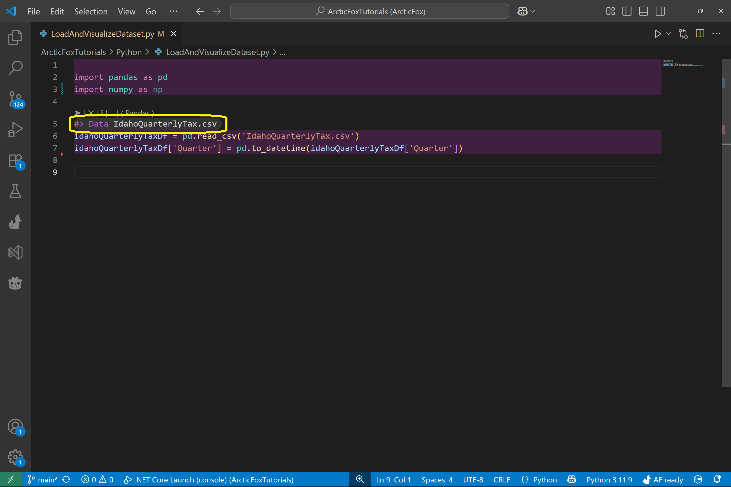
To begin, let's load in a dataset. We'll use a file called IdahoQuarterlyTax.csv, which contains quarterly tax return data across cities in Idaho.
First, add a Data kit and pass in the file name IdahoQuarterlyTax.csv.
This one kit will automatically:
- Import pandas and numpy
- Load the csv file into a dataframe
View Data
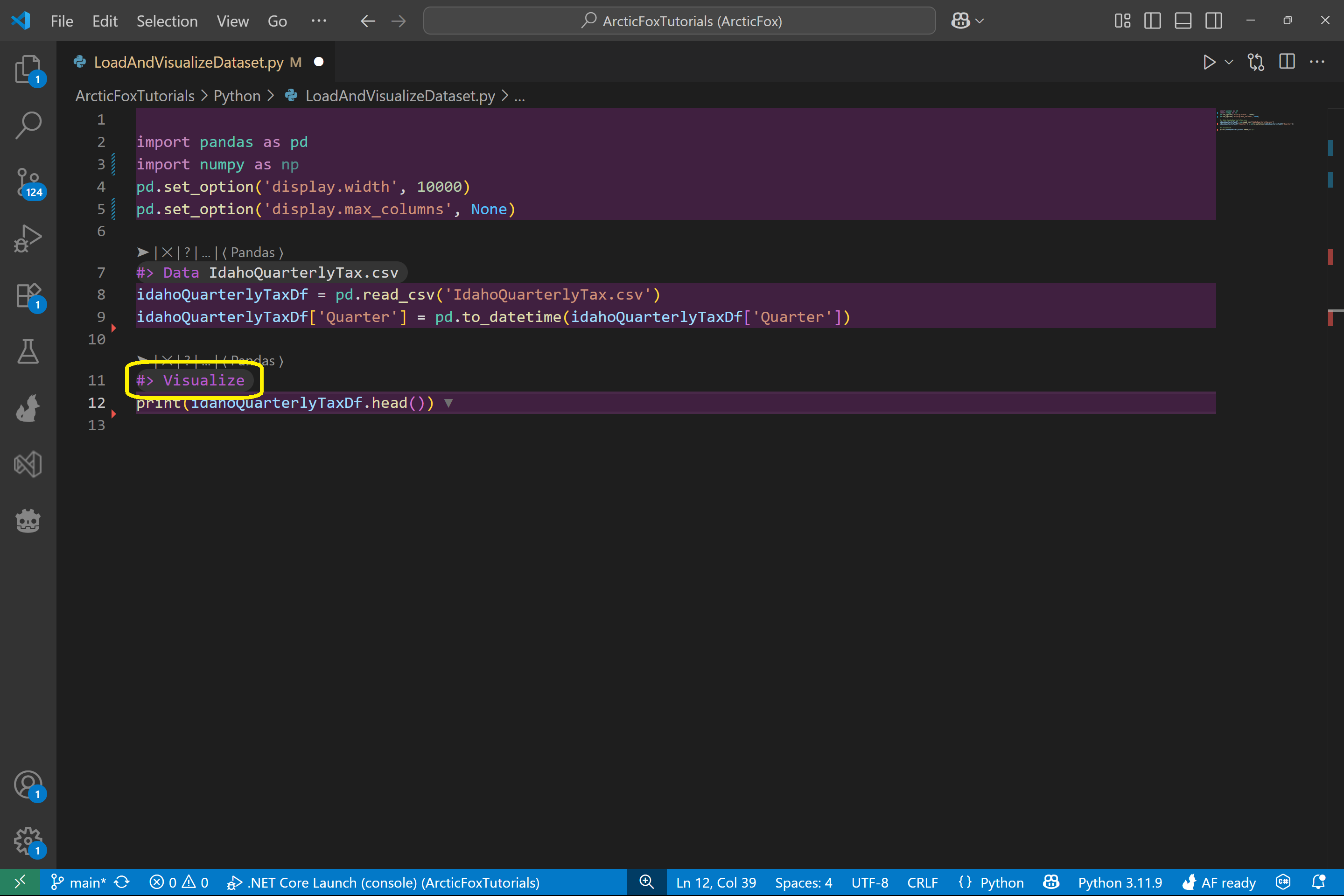
Next, let's inspect the data we just loaded.
Add a Visualize kit after the Data kit. This kit will:
- Add code to ensure all columns are visible in the output
- Print the most recent dataframe you've loaded
- Add an arrow symbol next to the print statement indentifying that Arctic Fox will write the printed output as comments directly into your file
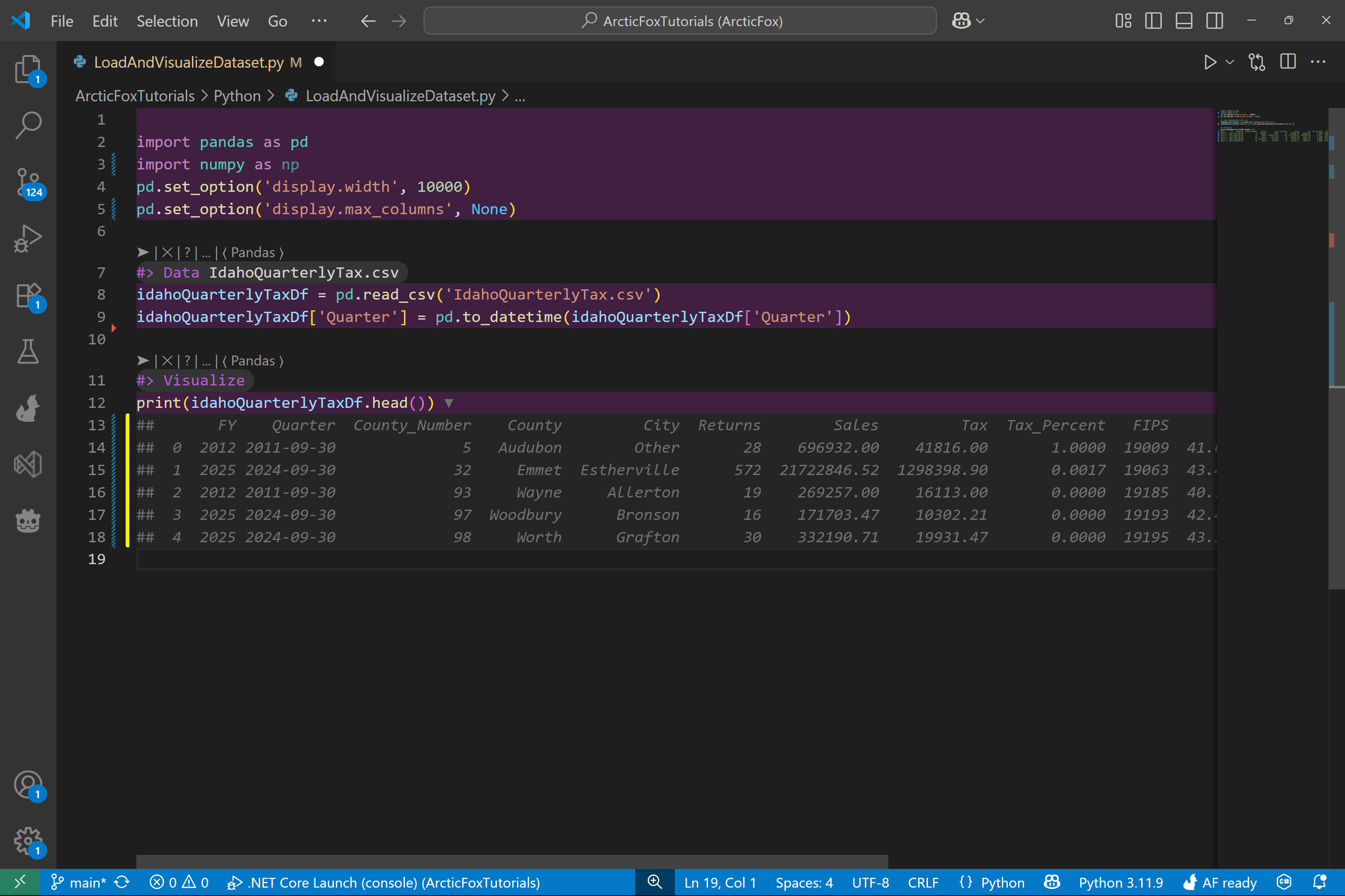
Run the script and Arctic Fox writes the print output into your file as line comments.
Filter Data
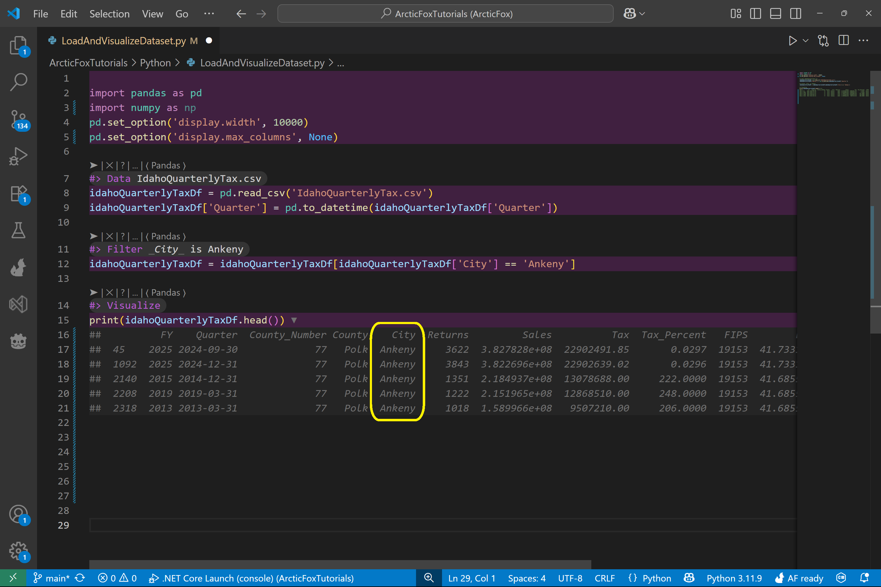
Let's zoom in on a single city. In this example, we'll filter the data to only show tax records from Ankeny.
To do this, add a Filter kit with phrase _City_ is Ankeny . This filters your dataframe to just the rows where the City column is Ankeny.
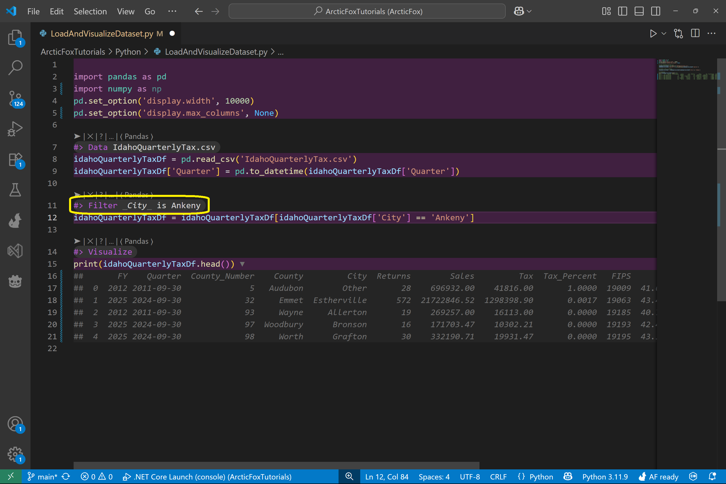
Run the script again and check the output of the Visualize kit. You'll now see only rows for Ankeny.
Plot Data
Let's turn that filtered data into a line graph so we can see how returns trend over time.
Add a Line kit like this and pass in Quarter for --x and Returns for --y.
This will create a line graph with:
- Quarter on the x-axis (the monthly quarter)
- Returns on the y-axis (number of tax returns)
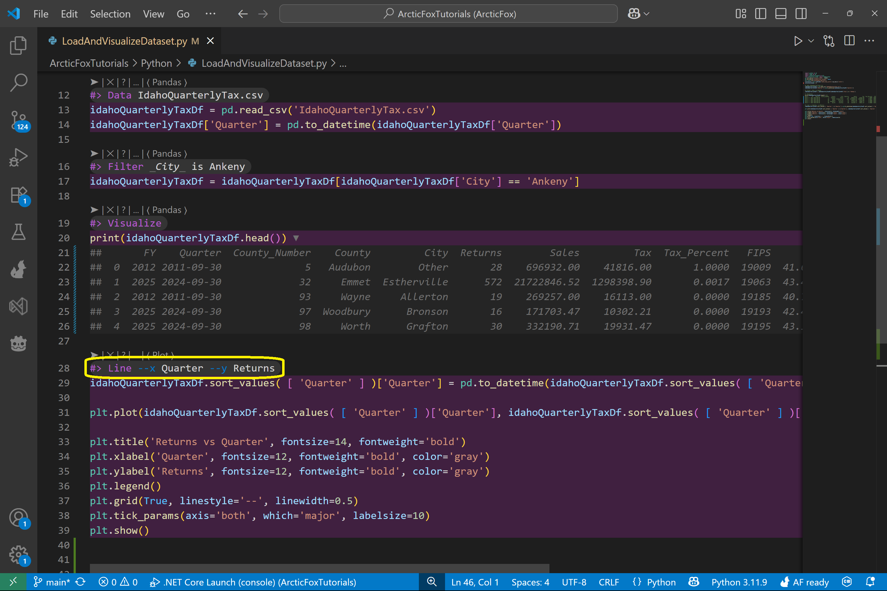
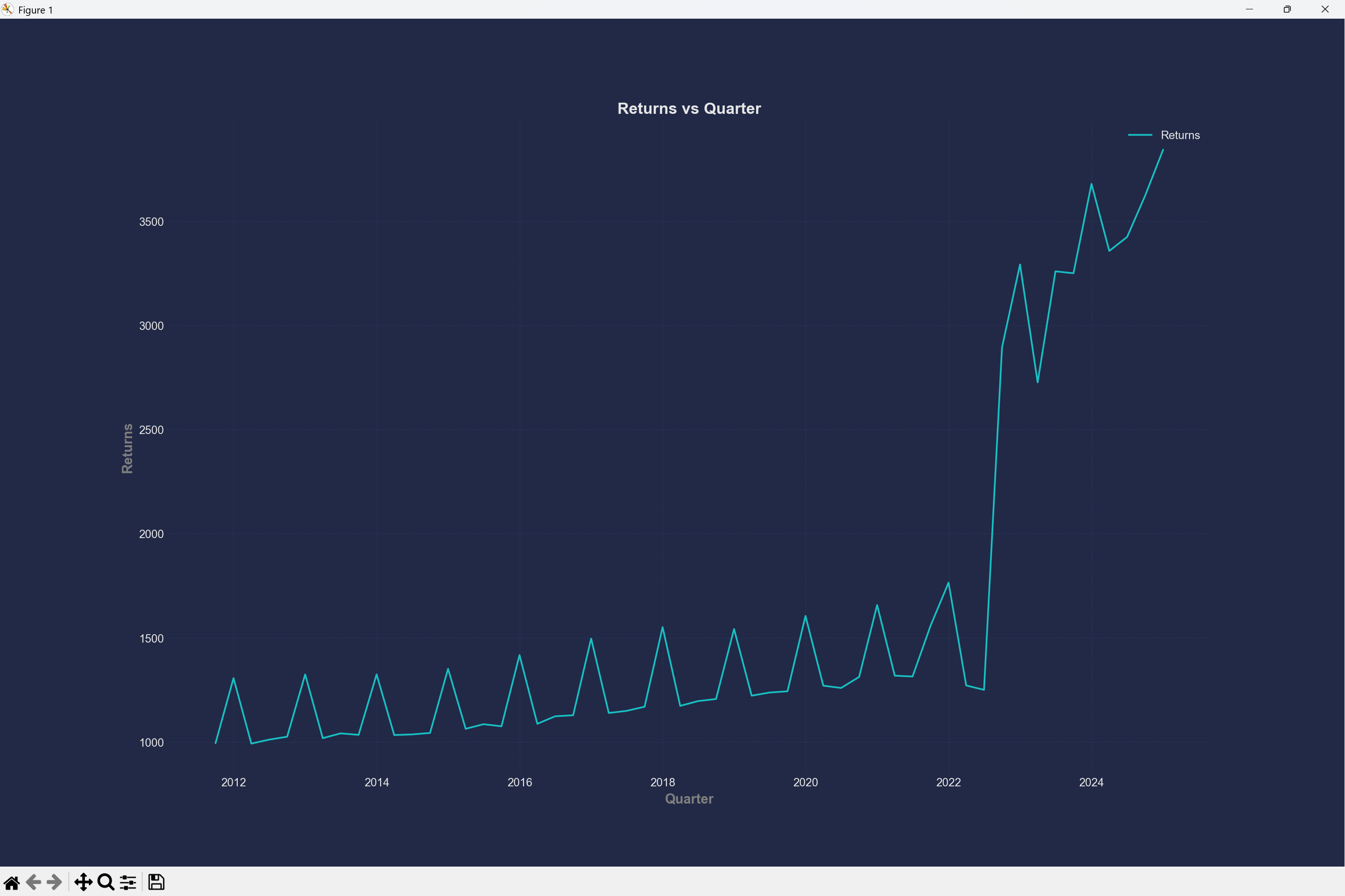
Now run the Python script again, and you'll see the resulting graph of the number of returns of time for Ankeny.
And We're Done!
In this guide, we:
- Loaded tax data from a CSV
- Viewed the data right in the Python file
- Filtered it down to a single city (Ankeny)
- Plotted tax return trends using a line graph
This is just a taste of what Arctic Fox can do - you've already started doing real data analysis without touching imports, boilerplate, or tedious setup.
See you in the next one!