Using Kit Guides in Arctic Fox
This post shows how to use the Guide feature in Arctic Fox. Kits comes with a built-in guide that helps you understand how to use the kit step by step. The guide will ask you questions, give you options as buttons to click, and help fill out the kit for you. When the guide finishes, your kit will be fully written, with just a few ? values for you to fill in.
Let's walk through how it works using a bar chart example!
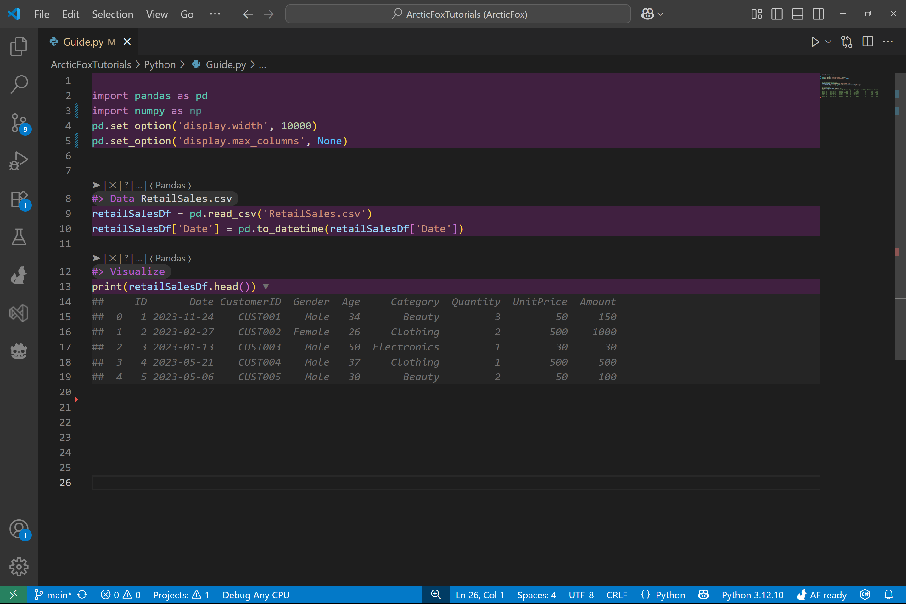
Start with Data Loaded and Previewed
For this walkthrough, we'll use the example sales data from Giga Sheets. We'll start by having already added the Data and Visualize kits to load and preview the dataset.
Below, you can see the first few rows of the data:
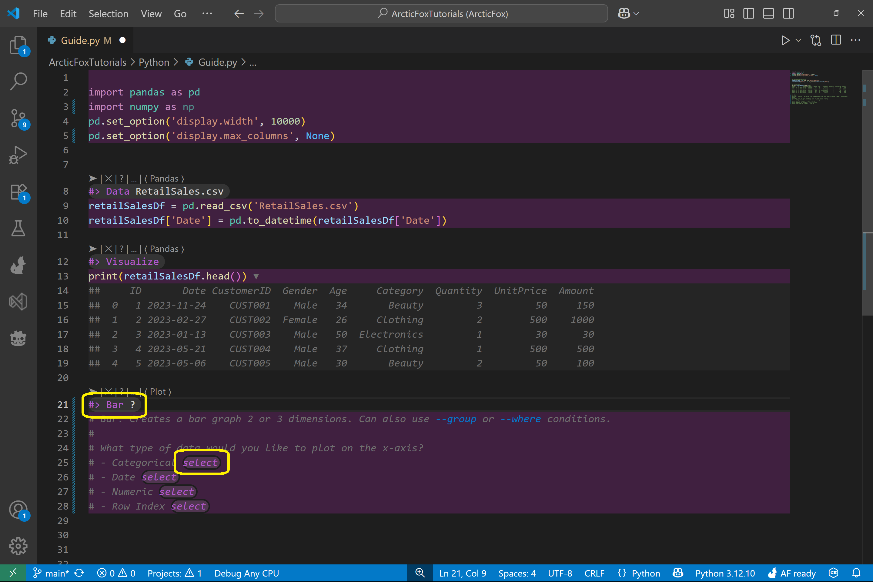
Add a Bar Kit and Launch the Guide
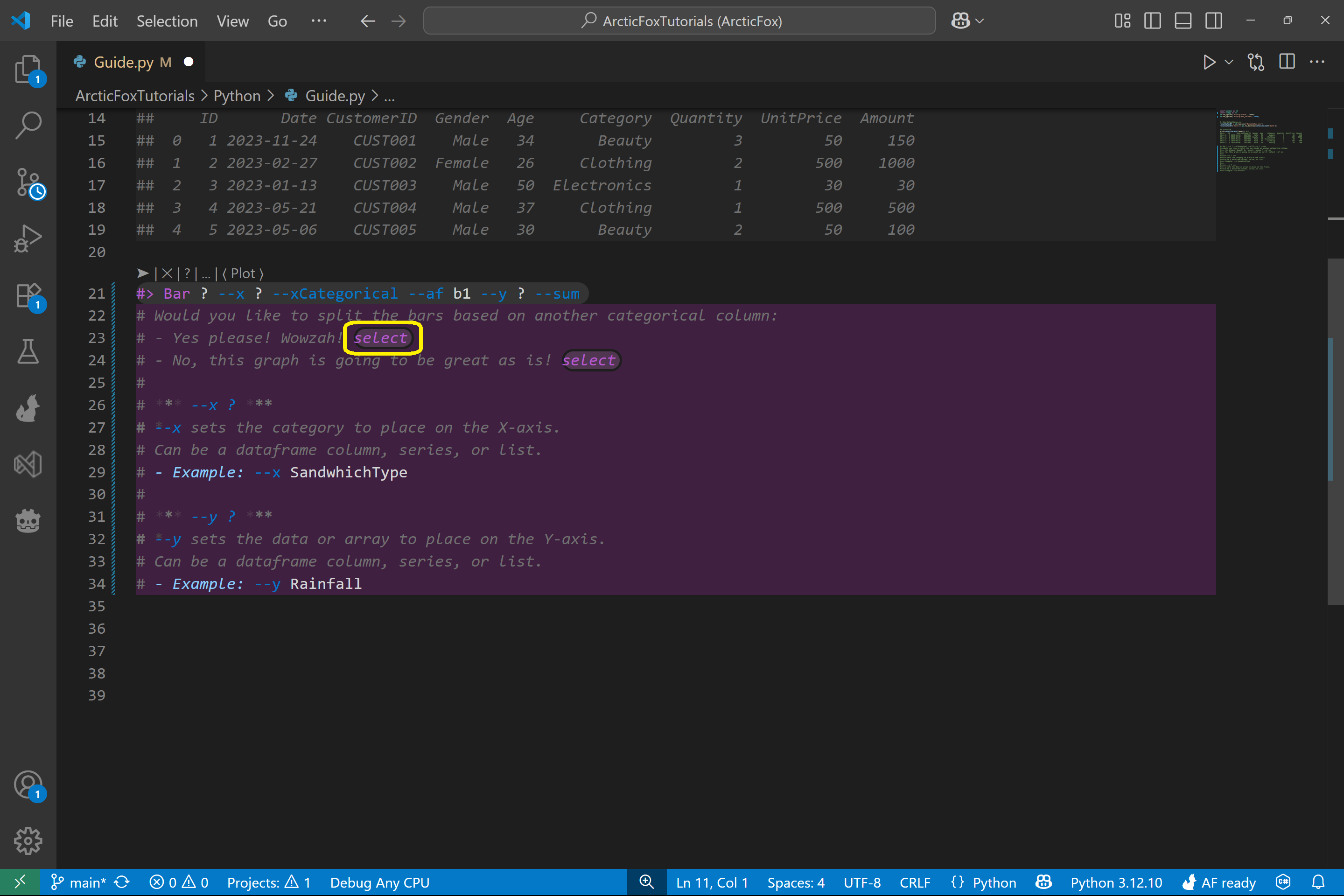
Next, we'll add the Bar kit to generate a bar chart. To launch the guide, simply add a ? to the kit. This tells Arctic Fox you want to use the guide.
The guide will be generated inside your Python file as commented lines.
Once the guide appears, click the select button for the option you want. In this example, we click Categorical to indicate we want to plot by category on the x-axis.
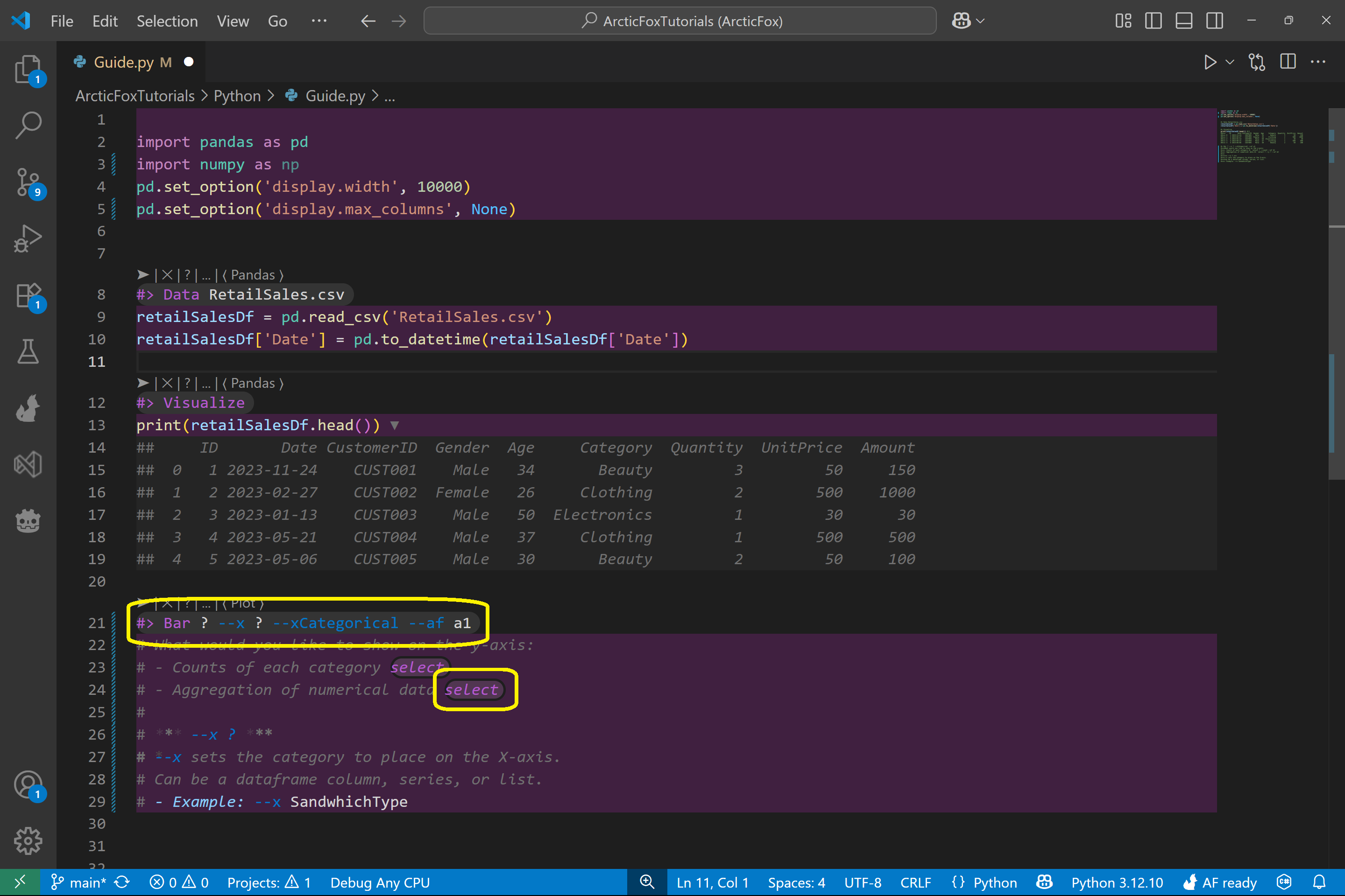
When we select Categorical, the --x and --xCategorical options are added to the kit. The guide updates based on what you've chosen so far.
Next, we select Aggregation of numerical data to summarize our data with a numeric column.
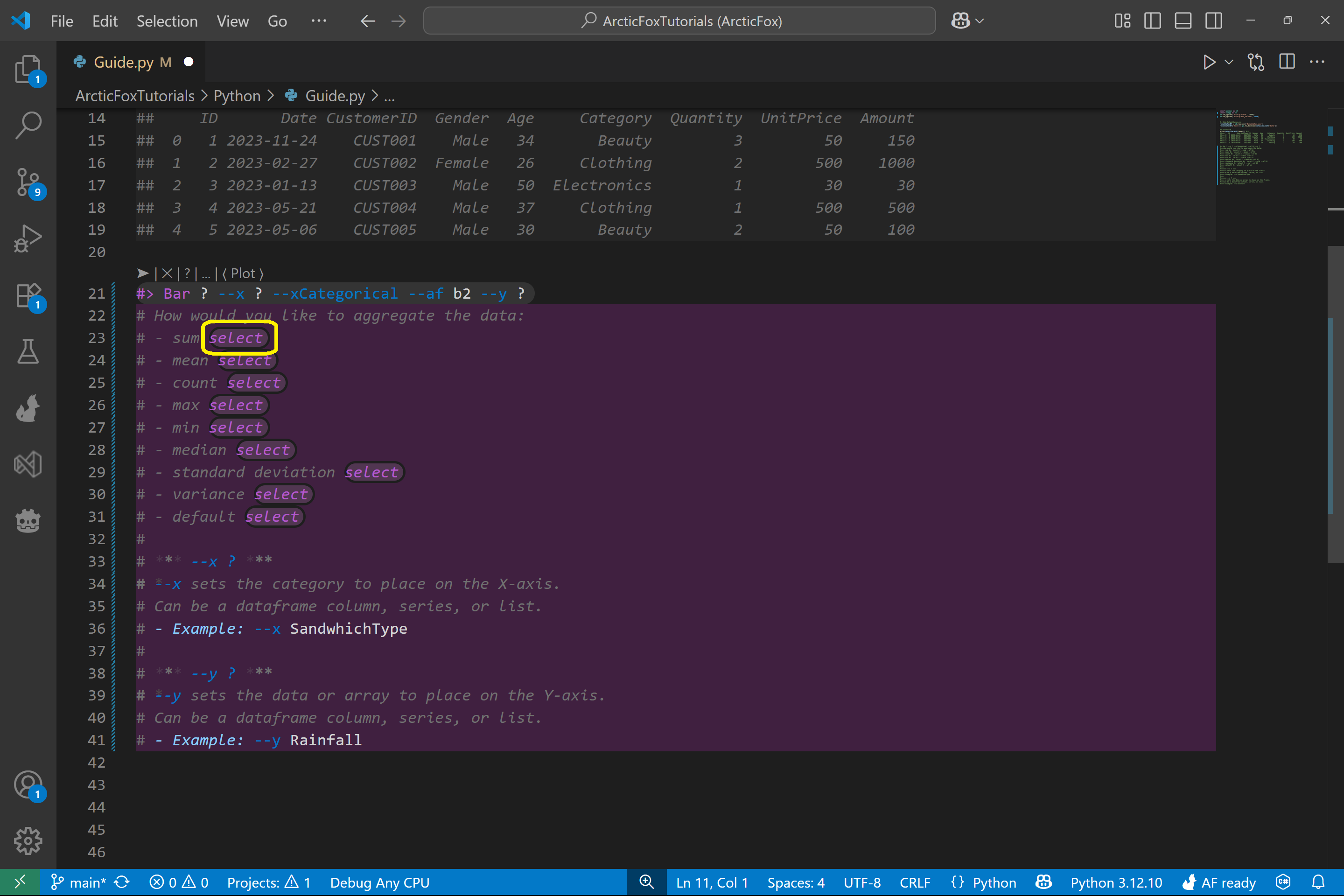
The guide updates again and asks how to perform the aggregation. We select sum, so the bar chart will show the sum of values from a column.
The final question in this kit's guide is whether we want to group the data based on a column's categories. We select yes.
Fill in the Kit Parameters
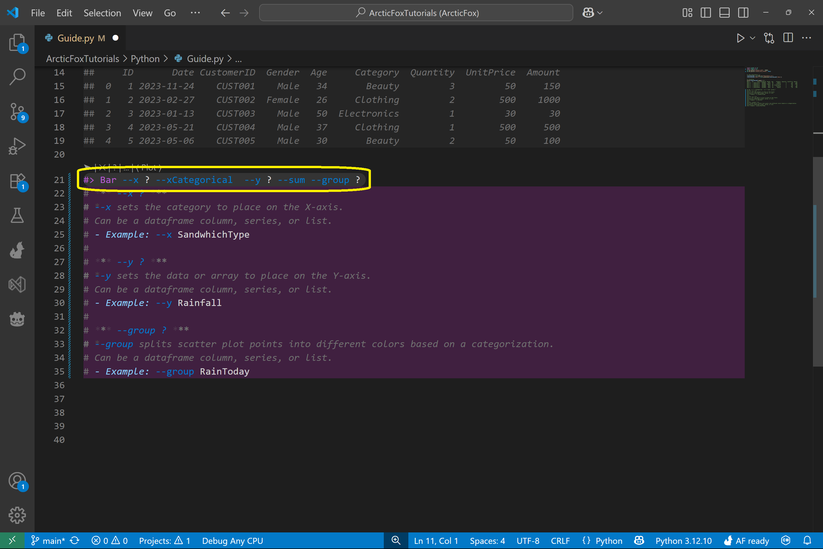
At this point, the guide has reached the end of its decision tree and filled in the kit with these options:
- --x
- --xCategorical
- --y
- --sum
- --group
You'll now see that some of these options still have ? values. These are spots for you to enter the specific column names from your dataset. Each option with a ? also shows descriptions and examples to help you choose.
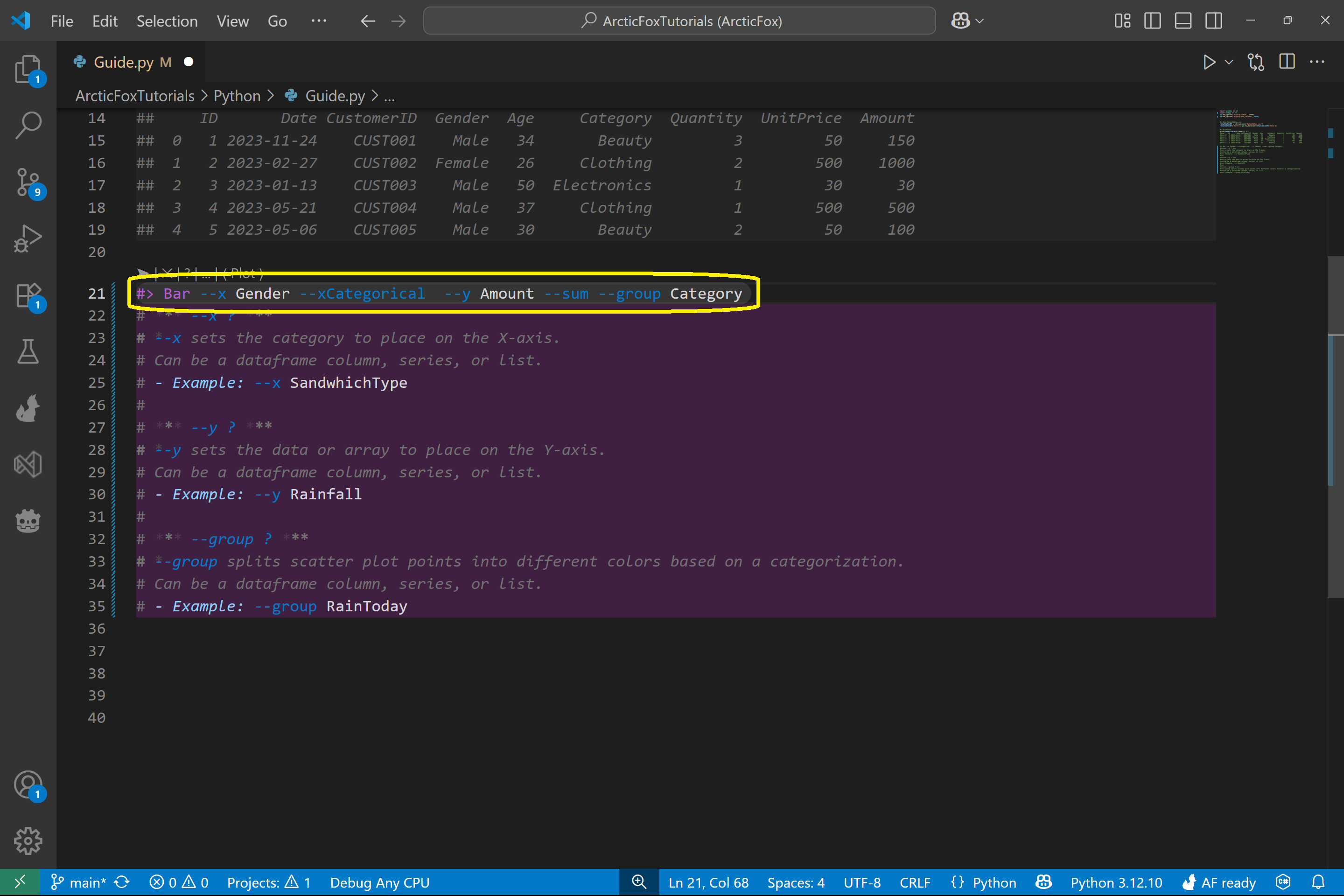
Let's fill them in:
- --x Gender
- --y Amount
- --group Category
Your final kit should look like this:
Run the Kit and Generate Code
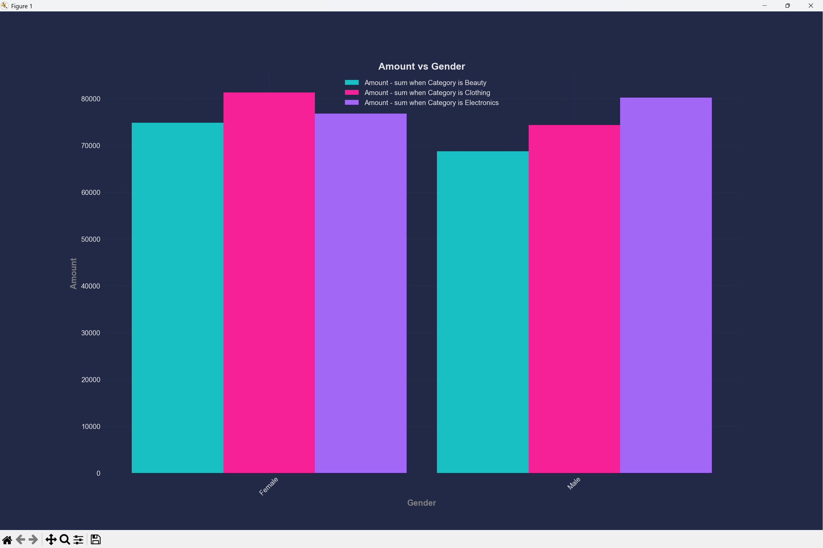
Once the kit is complete, run Arctic Fox and it will generate the Python code to produce your bar chart!
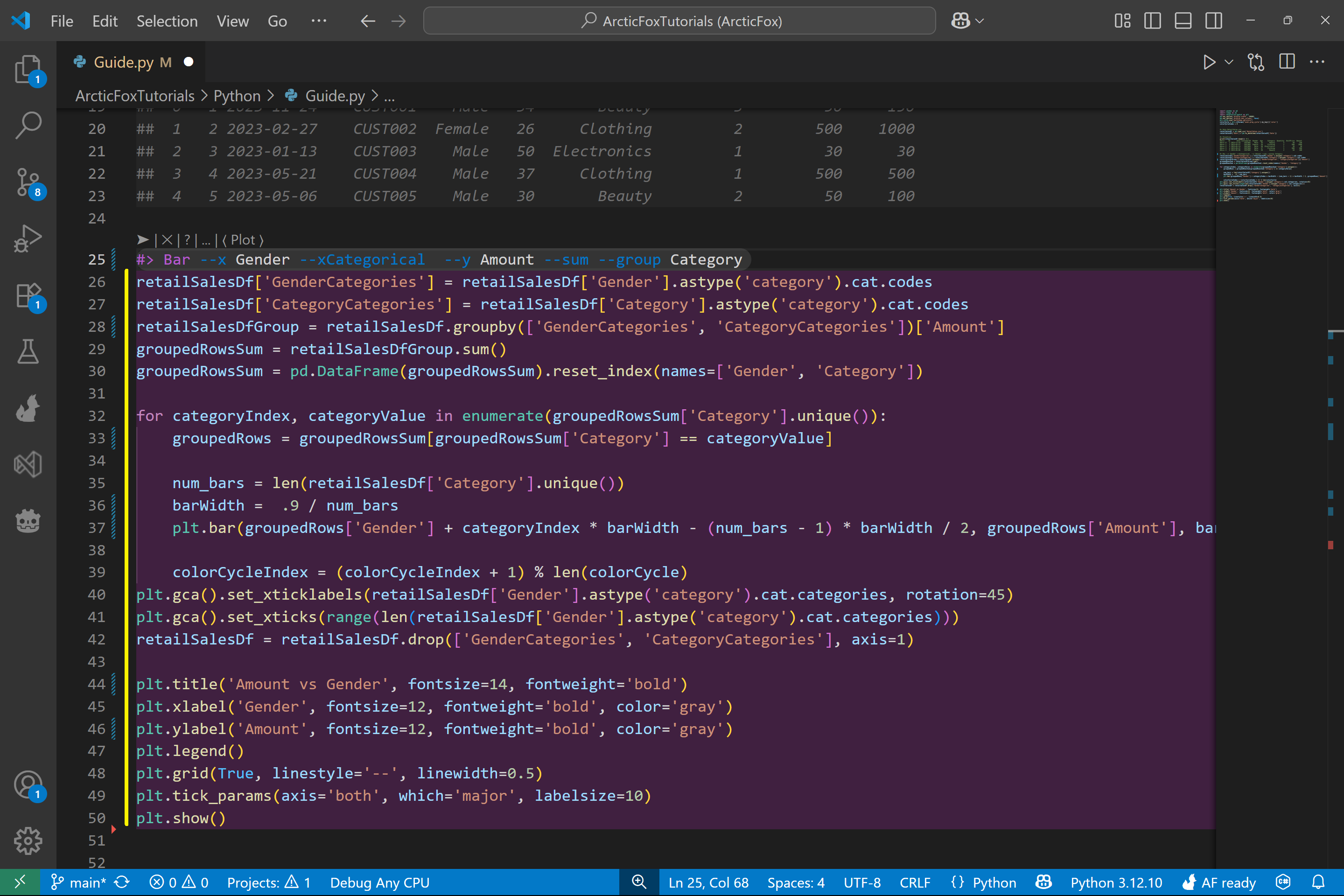
Now run the Python script, and your bar chart is created. Based on the sample data, you'll see that females spent the most on clothing, while males spent the most on electronics.
What We Covered
In this walkthrough, we:
- Used the Guide to walk through configuring a kit
- Added a Bar kit with a ? to trigger the guide
- Selected options through the guide interface
- Filled in final parameters with column names
- Ran the kit and generated a bar chart from the dataset
Thanks for following along! Arctic Fox kits are designed to guide you intuitively through coding tasks—no digging through docs required. Stay tuned for more guides on kits and visualizations!