Violin
Creates a violin plot to show the distribution of data for 1 or more columns, shows a shape between the min and max of a column the show the distribution of data from the min to the max
Options
x: Specifies the data column, or columns (can be more than one), to use on the x-axis
where: Condition on which to filter the data
samePlot: A flag that forces multiple plots to be rendered on the same plot
sameWindow : A flag that forces multiple plots to be rendered on the same window
Examples
Example 1 - Violin Plots for All Numeric Columns
Violin charts help visualize the distribution and density of data. This example creates a single combined plot that includes violin charts for each numeric column in the dataframe. Columns that are non-numeric are excluded.
#> Violin
AFLEFT  xTickIndex = 0
for i, boxplotColumn in enumerate(pokemonDf.columns):
    if is_numeric_dtype(pokemonDf[boxplotColumn]) and not is_bool_dtype(pokemonDf[boxplotColumn]):
        plt.violinplot(pokemonDf[boxplotColumn],  positions=[xTickIndex])
        xTickIndex += 1

xTicks = []
for i, boxplotColumn in enumerate(pokemonDf.columns):
    if is_numeric_dtype(pokemonDf[boxplotColumn]) and not is_bool_dtype(pokemonDf[boxplotColumn]):
        xTicks.append(boxplotColumn)

plt.gca().set_xticklabels(xTicks)
plt.gca().set_xticks(range(len(xTicks)))

plt.title('pokemonDf', fontsize=14, fontweight='bold')
plt.legend()
plt.grid(True, linestyle='--', linewidth=0.5)
plt.tick_params(axis='both', which='major')  AFRIGHT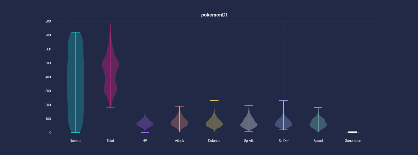
Example 2 - Violin Plots on Separate Axis
Instead of showing all numeric columns in a single plot, this example separates the violin charts into individual subplots. Each subplot represents a single numeric column, making it easier to compare distributions side-by-side and prevents columns with vastly different distributions from being visualized poorly.
#> Violin --separate
AFLEFT  nonNumericColumnCount = 0
for i, boxplotColumn in enumerate(pokemonDf.columns):
    if is_numeric_dtype(pokemonDf[boxplotColumn]) and not is_bool_dtype(pokemonDf[boxplotColumn]):
        nonNumericColumnCount += 1

_, boxplotAxes = plt.subplots(nrows=1, ncols=nonNumericColumnCount, figsize=(10, 5))
xTickIndex = 0
for i, boxplotColumn in enumerate(pokemonDf.columns):
    if is_numeric_dtype(pokemonDf[boxplotColumn]) and not is_bool_dtype(pokemonDf[boxplotColumn]):
        boxplotAxes[xTickIndex].violinplot(pokemonDf[boxplotColumn],  positions=[0])
        xTickIndex += 1

xTickIndex = 0
for i, boxplotColumn in enumerate(pokemonDf.columns):
    if is_numeric_dtype(pokemonDf[boxplotColumn]) and not is_bool_dtype(pokemonDf[boxplotColumn]):
        boxplotAxes[xTickIndex].set_xticklabels([boxplotColumn])
        boxplotAxes[xTickIndex].set_xticks([0])
        xTickIndex += 1

plt.suptitle('pokemonDf', fontsize=14, fontweight='bold')
plt.legend()
plt.grid(True, linestyle='--', linewidth=0.5)
plt.tick_params(axis='both', which='major')  AFRIGHT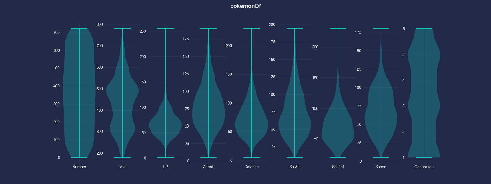
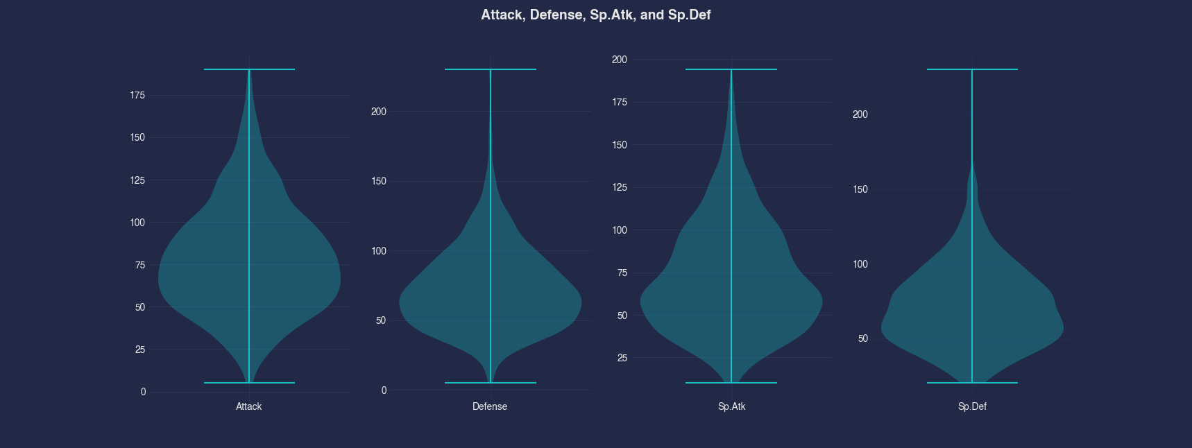
Example 3 - Violin Plots for Selected Columns on Separate Axis
This example plots only the Attack, Defense, Sp.Atk, and Sp.Def columns, but each as its own subplot. This view is useful when the goal is to compare the shape and spread of each distribution individually without disparate distributions.
#> Violin --x Attack Defense Sp.Atk Sp.Def --separate
AFLEFT  _, boxplotAxes = plt.subplots(nrows=1, ncols=4, figsize=(10, 5))
boxplotAxes[0].violinplot(pokemonDf['Attack'],  positions=[0])
boxplotAxes[0].set_xticks([0], ['Attack'])

boxplotAxes[1].violinplot(pokemonDf['Defense'],  positions=[0])
boxplotAxes[1].set_xticks([0], ['Defense'])

boxplotAxes[2].violinplot(pokemonDf['Sp.Atk'],  positions=[0])
boxplotAxes[2].set_xticks([0], ['Sp.Atk'])

boxplotAxes[3].violinplot(pokemonDf['Sp.Def'],  positions=[0])
boxplotAxes[3].set_xticks([0], ['Sp.Def'])

plt.suptitle('Attack, Defense, Sp.Atk, and Sp.Def', fontsize=14, fontweight='bold')
plt.legend()
plt.grid(True, linestyle='--', linewidth=0.5)
plt.tick_params(axis='both', which='major')  AFRIGHT