Scatter
Creates a scatter plot that can be 2 or 3 dimensions. Can also use --group or --where conditions.
Options
x: Specifies the data column to use on the x-axis
y: Specifies the data column to use on the y-axis
z: Specifies the data column to use on the z-axis
group: Column specifying how to color the data in the plot
where: Condition on which to filter the data
3d: Flag that projects 2 dimensional groups onto a 3 dimensional plot
samePlot: A flag that forces multiple plots to be rendered on the same plot
sameWindow : A flag that forces multiple plots to be rendered on the same window
year: Specifies the year component of the dataset or time-related analysis. This flag allows you to filter or focus on data within a specific year for more granular insights
month : Denotes the month component of the dataset or time-related analysis. This flag helps you zoom into data for a particular month within a given year, offering a focused view of seasonal or monthly trends
day: Refers to the day component of the dataset or time-related analysis. This flag filters the data to represent specific days, providing a fine-grained level of detail for daily trends or activities.
Examples
Example 1 - Scatter Plot of Numerical Columns
A basic scatter plot showing how many points each player scored relative to their field goal percentage. This type of chart visualizes whether more efficient shooters tend to score more points overall.
#> Scatter --x FG_Percent --y Points
AFLEFT  plt.scatter(nBADf['FG_Percent'], nBADf['Points'], color=colorCycle[colorCycleIndex], label='Points')

plt.title('Points vs FG_Percent', fontsize=14, fontweight='bold')
plt.xlabel('FG_Percent', fontsize=12, fontweight='bold', color='gray')
plt.ylabel('Points', fontsize=12, fontweight='bold', color='gray')
plt.legend()
plt.grid(True, linestyle='--', linewidth=0.5)
plt.tick_params(axis='both', which='major', labelsize=10)  AFRIGHT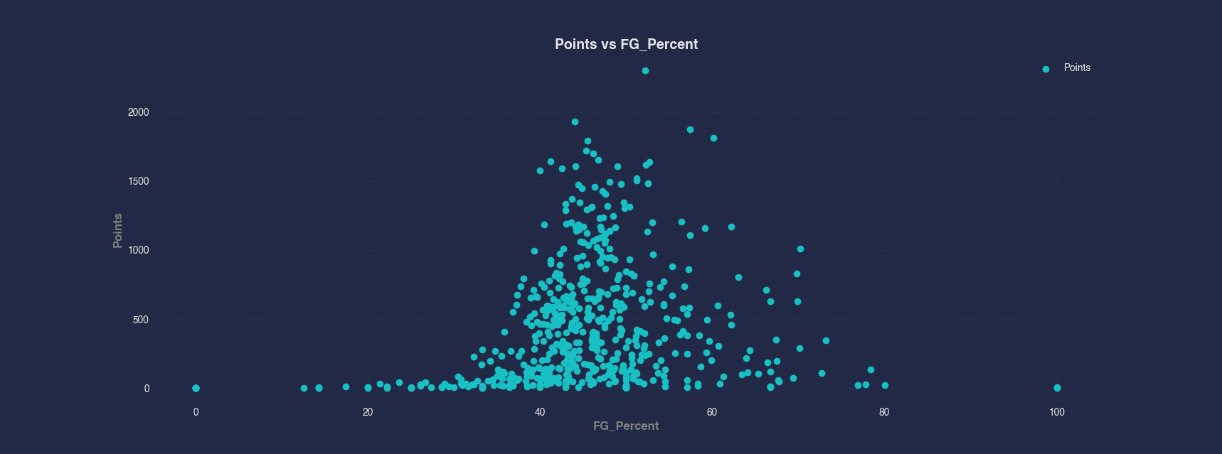
Example 2 - Scatter Plot of Numerical vs Categorical Columns
This scatter plot compares the age of each player by their team. The x-axis shows each team labels, while the y-axis shows player age. This examples identifies age distribution across teams.
#> Scatter --x Team --y Age
AFLEFT  plt.scatter(nBADf['Team'].astype('category').cat.codes, nBADf['Age'], color=colorCycle[colorCycleIndex], label='Age')

plt.gca().set_xticklabels(nBADf['Team'].astype('category').cat.categories, rotation=45)
plt.gca().set_xticks(range(len(nBADf['Team'].astype('category').cat.categories)))

plt.title('Age vs Team', fontsize=14, fontweight='bold')
plt.xlabel('Team', fontsize=12, fontweight='bold', color='gray')
plt.ylabel('Age', fontsize=12, fontweight='bold', color='gray')
plt.legend()
plt.grid(True, linestyle='--', linewidth=0.5)
plt.tick_params(axis='both', which='major', labelsize=10)  AFRIGHT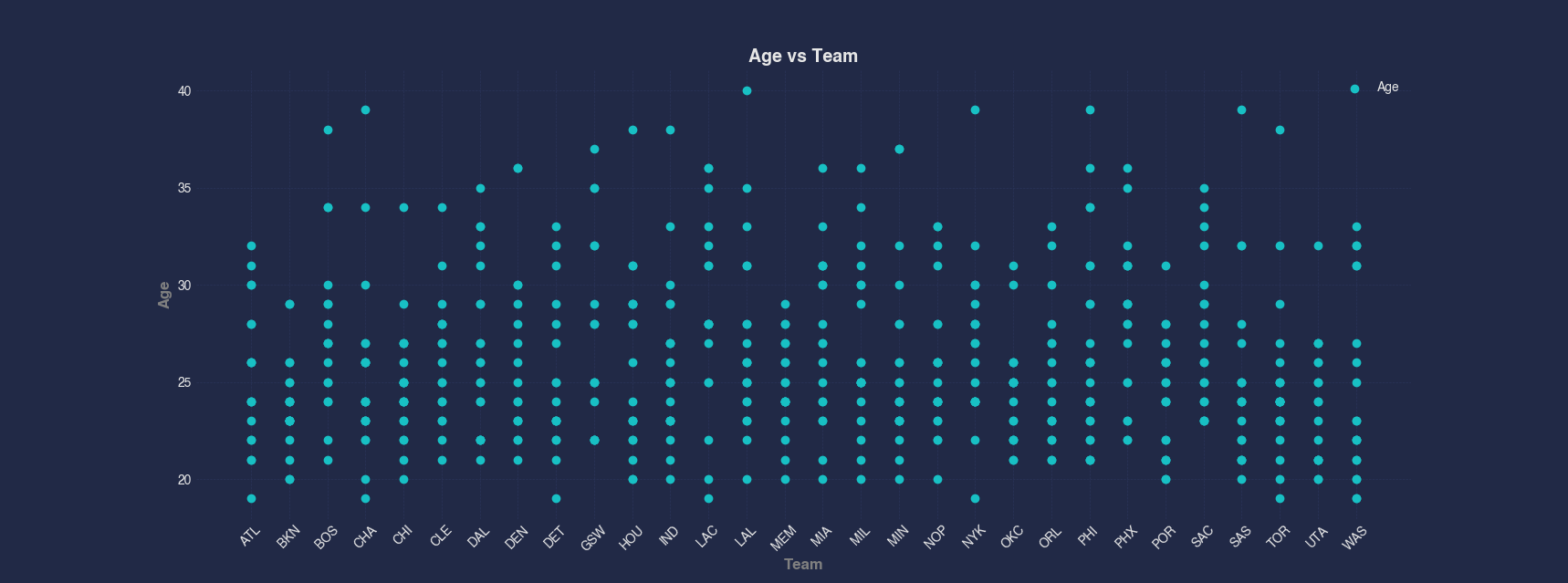
Example 3 - Scatter Plot by Index
In this example, we visualize the Points column directly against its index. This creates a simple trend view of scoring across the dataset making it easy to see data across a single column.
#> Scatter Points
AFLEFT  indexForPlot = range(len(nBADf['Points']))

plt.scatter(indexForPlot, nBADf['Points'], marker='o', color=colorCycle[colorCycleIndex], label='Points')

plt.title('Points vs Index', fontsize=14, fontweight='bold')
plt.xlabel('Index', fontsize=12, fontweight='bold', color='gray')
plt.ylabel('Points', fontsize=12, fontweight='bold', color='gray')
plt.legend()
plt.grid(True, linestyle='--', linewidth=0.5)
plt.tick_params(axis='both', which='major', labelsize=10)  AFRIGHT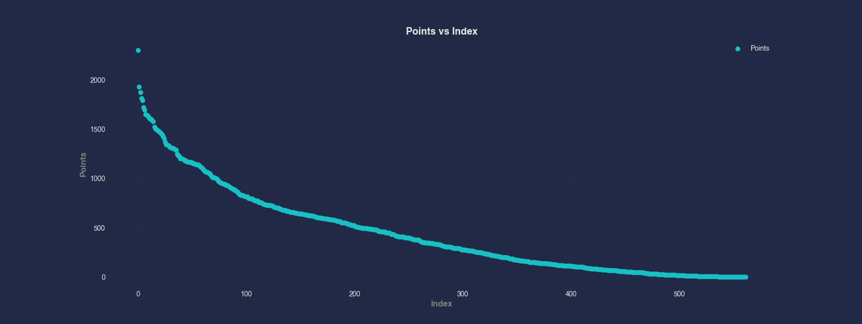
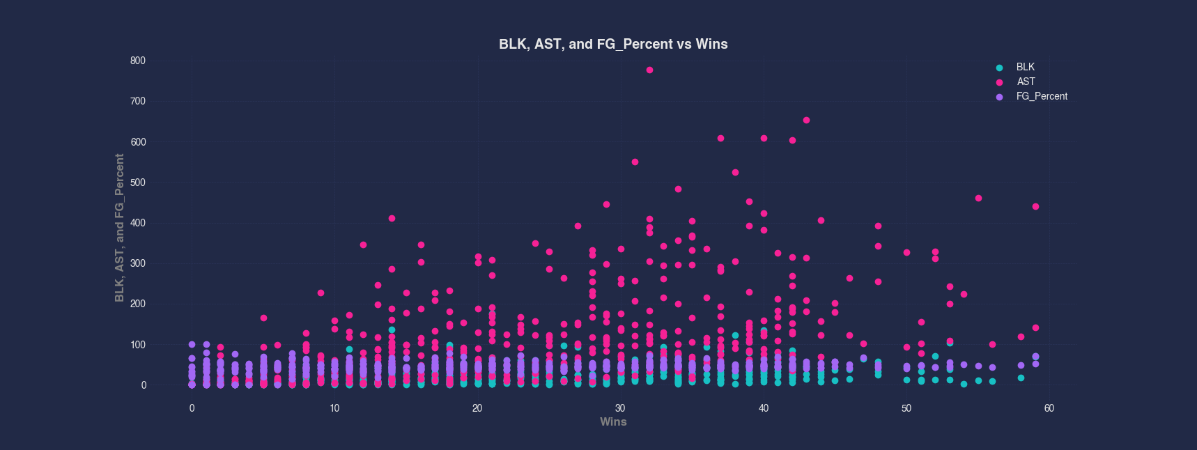
Example 4 - Scatter Plot of Multiple Columns
We compare three different performance metrics — BLK, AST, and FG_Percent — against Wins. Each metric is plotted with a different color on the same scatter plot, making it easier to spot how these variables trend with team success.
#> Scatter --x Wins --y BLK AST FG_Percent
AFLEFT  plt.scatter(nBADf['Wins'], nBADf['BLK'], color=colorCycle[colorCycleIndex], label='BLK')

colorCycleIndex = (colorCycleIndex + 1) % len(colorCycle)

plt.scatter(nBADf['Wins'], nBADf['AST'], color=colorCycle[colorCycleIndex], label='AST')

colorCycleIndex = (colorCycleIndex + 1) % len(colorCycle)

plt.scatter(nBADf['Wins'], nBADf['FG_Percent'], color=colorCycle[colorCycleIndex], label='FG_Percent')

plt.title('BLK, AST, and FG_Percent vs Wins', fontsize=14, fontweight='bold')
plt.xlabel('Wins', fontsize=12, fontweight='bold', color='gray')
plt.ylabel('BLK, AST, and FG_Percent', fontsize=12, fontweight='bold', color='gray')
plt.legend()
plt.grid(True, linestyle='--', linewidth=0.5)
plt.tick_params(axis='both', which='major', labelsize=10)  AFRIGHT