Line
Creates a line plot that can be 2 or 3 dimensions. Can also use --group or --where conditions.
Options
x: Specifies the data column to use on the x-axis
y: Specifies the data column to use on the y-axis
z: Specifies the data column to use on the z-axis
group: Column specifying how to color the data in the plot
where: Condition on which to filter the data
3d: Flag that projects 2 dimensional groups onto a 3 dimensional plot
samePlot: A flag that forces multiple plots to be rendered on the same plot
sameWindow : A flag that forces multiple plots to be rendered on the same window
year: Specifies the year component of the dataset or time-related analysis. This flag allows you to filter or focus on data within a specific year for more granular insights
month : Denotes the month component of the dataset or time-related analysis. This flag helps you zoom into data for a particular month within a given year, offering a focused view of seasonal or monthly trends
day: Refers to the day component of the dataset or time-related analysis. This flag filters the data to represent specific days, providing a fine-grained level of detail for daily trends or activities.
Examples
Example 1 - Line Chart of a Numerical Column vs Date Column
A simple and commonly used way to visualize stock data is by plotting a line chart of a value over time. In this example, we display the High column plotted against the Date to understand how the highest recorded stock prices changed over time.
#> Line --x Date --y High
AFLEFT  appleStockDf.sort_values( [ 'Date' ] )['Date'] = pd.to_datetime(appleStockDf.sort_values( [ 'Date' ] )['Date'])

plt.plot(appleStockDf.sort_values( [ 'Date' ] )['Date'], appleStockDf.sort_values( [ 'Date' ] )['High'], color=colorCycle[colorCycleIndex], label='High')

plt.title('High vs Date', fontsize=14, fontweight='bold')
plt.xlabel('Date', fontsize=12, fontweight='bold', color='gray')
plt.ylabel('High', fontsize=12, fontweight='bold', color='gray')
plt.legend()
plt.grid(True, linestyle='--', linewidth=0.5)
plt.tick_params(axis='both', which='major', labelsize=10)  AFRIGHT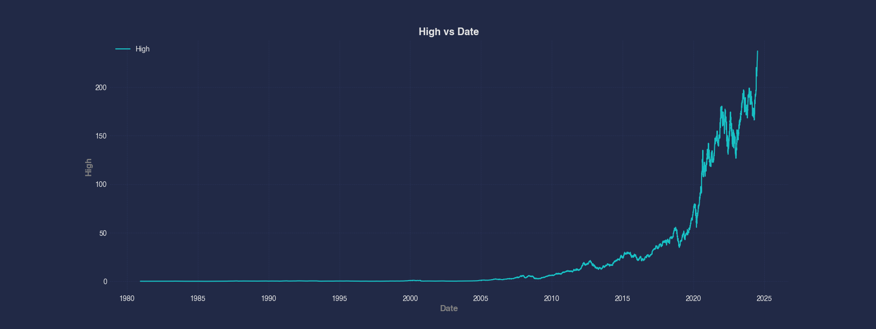
Example 2 - Line Chart With a Filtering Condition
To narrow down the data to a more recent time period, this example filters the dataframe to only include rows where the Date is in or after the year 2023. Then we plot the Volume column against Date to visualize recent trading activity.
#> Line --x Date --y Volume
AFLEFT  appleStockDf['Date'] = pd.to_datetime(appleStockDf['Date'])
appleStockDfQueried = appleStockDf[appleStockDf['Date'].dt.year >= 2023]

appleStockDfQueried.sort_values( [ 'Date' ] )['Date'] = pd.to_datetime(appleStockDfQueried.sort_values( [ 'Date' ] )['Date'])

plt.plot(appleStockDfQueried.sort_values( [ 'Date' ] )['Date'], appleStockDfQueried.sort_values( [ 'Date' ] )['Volume'], color=colorCycle[colorCycleIndex], label='Volume')

plt.title('Volume vs Date, where Date >= 2023', fontsize=14, fontweight='bold')
plt.xlabel('Date', fontsize=12, fontweight='bold', color='gray')
plt.ylabel('Volume', fontsize=12, fontweight='bold', color='gray')
plt.legend()
plt.grid(True, linestyle='--', linewidth=0.5)
plt.tick_params(axis='both', which='major', labelsize=10)  AFRIGHT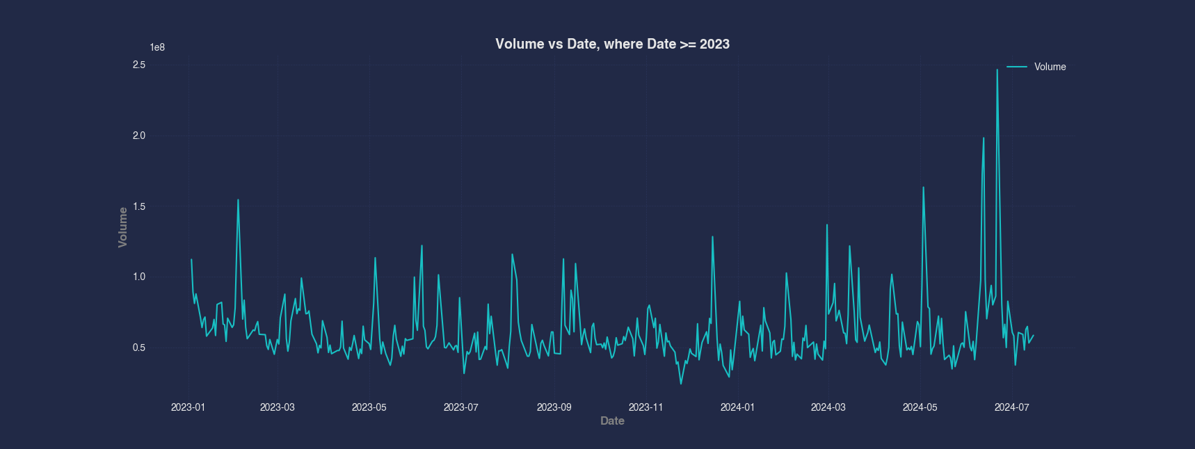
Example 3 - Line Chart Grouped by a Categorical Column
Grouped visualizations help compare trends across categories. In this example, we group the data by Decade and plot Volume vs High for each group separately, using a different color for each decade to highlight changes in the relationship over time.
#> Line --x High --y Volume --group Decade
AFLEFT  appleStockDf['DecadeCategories'] = appleStockDf['Decade'].astype('category').cat.codes
for decadeIndex, decadeValue in enumerate(appleStockDf['Decade'].unique()):
    groupedRows = appleStockDf[appleStockDf['Decade'] == decadeValue]

    plt.plot(groupedRows.sort_values( [ 'High' ] )['High'], groupedRows.sort_values( [ 'High' ] )['Volume'], color=colorCycle[colorCycleIndex], label='Volume' + f" when Decade is {appleStockDf.sort_values( [ 'High' ] )['Decade'].astype('category').cat.categories[decadeIndex]}", alpha=0.7)

    colorCycleIndex = (colorCycleIndex + 1) % len(colorCycle)
appleStockDf = appleStockDf.drop(['DecadeCategories'], axis=1)

plt.title('Volume vs High', fontsize=14, fontweight='bold')
plt.xlabel('High', fontsize=12, fontweight='bold', color='gray')
plt.ylabel('Volume', fontsize=12, fontweight='bold', color='gray')
plt.legend()
plt.grid(True, linestyle='--', linewidth=0.5)
plt.tick_params(axis='both', which='major', labelsize=10)  AFRIGHT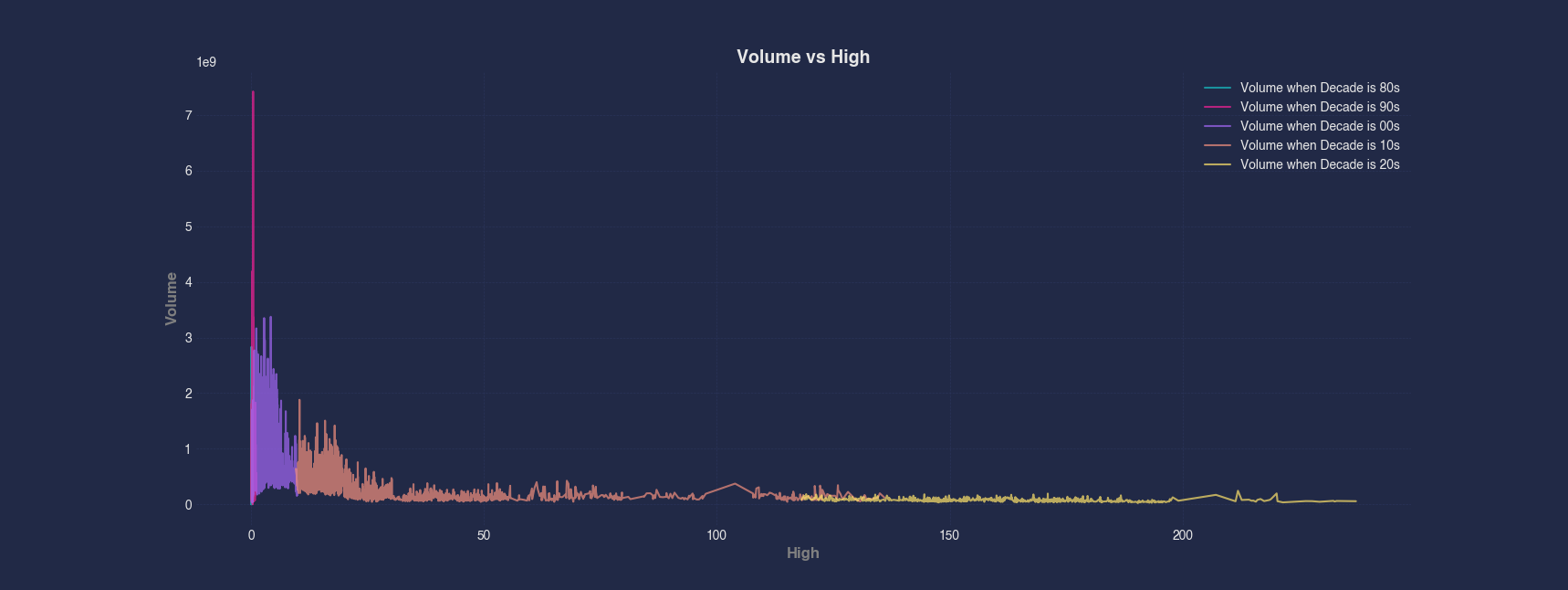
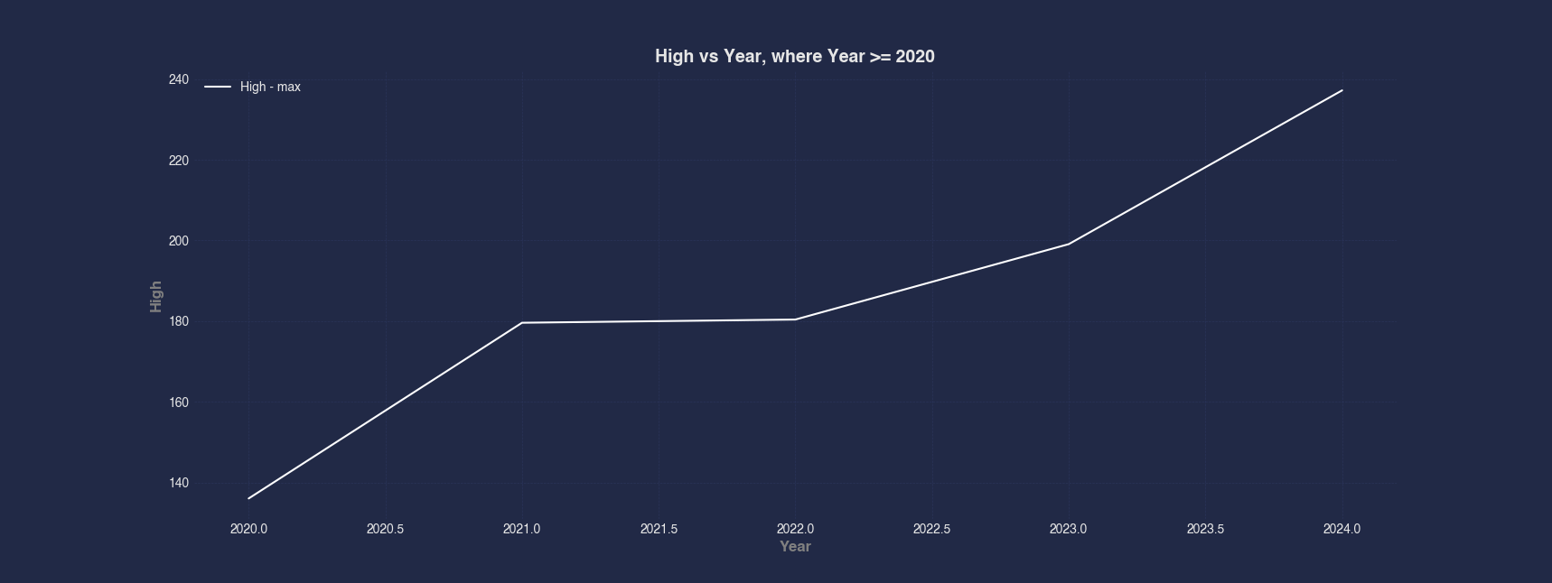
Example 4 - Line Chart With Aggregation
Instead of plotting every data point, this example aggregates the data by Year and calculates the maximum High value within each year. This is useful for summarizing and comparing peak values over time, especially when filtering for only recent years (2020 and later).
#> Line --x Year --y High --max --where Year >= 2020
AFLEFT  appleStockDfQueried = appleStockDf[appleStockDf['Year'] >= 2020]

appleStockDfQueriedGroup = appleStockDfQueried.groupby(['Year'])['High']
appleStockDfQueriedGroupMax = appleStockDfQueriedGroup.max()
appleStockDfQueriedGroupMax = pd.DataFrame(appleStockDfQueriedGroupMax).reset_index(names=['Year'])

plt.plot(appleStockDfQueriedGroupMax['Year'], appleStockDfQueriedGroupMax['High'], color=colorCycle[colorCycleIndex], label='High' + ' - max')

plt.title('High vs Year, where Year >= 2020', fontsize=14, fontweight='bold')
plt.xlabel('Year', fontsize=12, fontweight='bold', color='gray')
plt.ylabel('High', fontsize=12, fontweight='bold', color='gray')
plt.legend()
plt.grid(True, linestyle='--', linewidth=0.5)
plt.tick_params(axis='both', which='major', labelsize=10)  AFRIGHT