Histogram
Plots a histogram using the matplotlib library for the data provided
Options
x: Specifies the data column to use on the x-axis
y: Specifies the data column to use on the y-axis
bins: the number of bins, channels, buckets, etc. to be used by the histogram
3d: Flag that projects 2 dimensional groups onto a 3 dimensional plot
samePlot: A flag that forces multiple plots to be rendered on the same plot
sameWindow : A flag that forces multiple plots to be rendered on the same window
year: Specifies the year component of the dataset or time-related analysis. This flag allows you to filter or focus on data within a specific year for more granular insights
month : Denotes the month component of the dataset or time-related analysis. This flag helps you zoom into data for a particular month within a given year, offering a focused view of seasonal or monthly trends
day: Refers to the day component of the dataset or time-related analysis. This flag filters the data to represent specific days, providing a fine-grained level of detail for daily trends or activities.
Examples
Example 1 - Plot Histogram of Single Column
A histogram is useful to see how values are distributed across a column. In this example, we plot the histogram of the High column to observe the distribution of daily high prices in the Apple stock dataset.
#> Histogram --x High
AFLEFT  plt.hist(appleStockDf['High'], bins=10)

plt.title('High Histogram', fontsize=14, fontweight='bold')
plt.xlabel('High', fontsize=12, fontweight='bold', color='gray')
plt.ylabel('Counts', fontsize=12, fontweight='bold', color='gray')
plt.legend()
plt.grid(True, linestyle='--', linewidth=0.5)
plt.tick_params(axis='both', which='major', labelsize=10)  AFRIGHT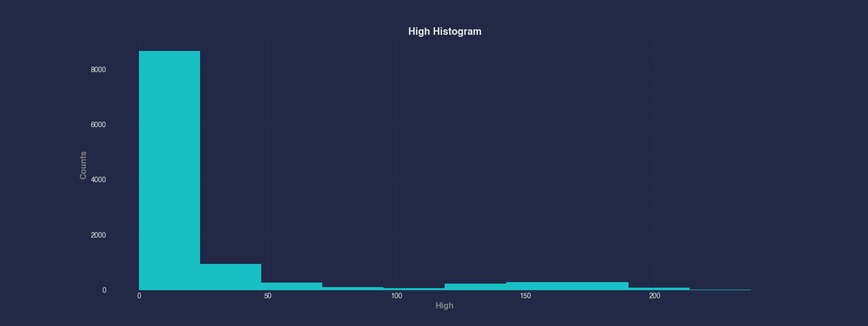
Example 2 - Plot Histogram of Computed Ratio Column
You can plot histograms of computed columns the same way as standard columns. Here we first compute the HighDivLow ratio by dividing the High column by the Low column, then plot a histogram to analyze how this ratio varies across the dataset.
#> Histogram --x HighDivLow
AFLEFT  plt.hist(appleStockDf['HighDivLow'], bins=10)

plt.title('HighDivLow Histogram', fontsize=14, fontweight='bold')
plt.xlabel('HighDivLow', fontsize=12, fontweight='bold', color='gray')
plt.ylabel('Counts', fontsize=12, fontweight='bold', color='gray')
plt.legend()
plt.grid(True, linestyle='--', linewidth=0.5)
plt.tick_params(axis='both', which='major', labelsize=10)  AFRIGHT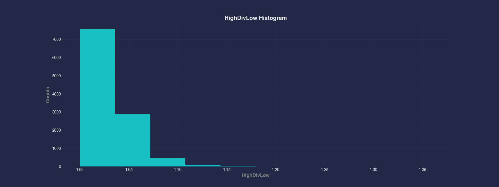
Example 3 - Plot Histogram of Dates
Although histograms are typically used for numeric data, you can also visualize how dates are distributed in a dataset. This example shows how the Apple stock data is spread across time by plotting a histogram of the Date column. Unsurprisingly, the data is roughly evenly distributed according to the dates as the stock was traded daily during the week.
#> Histogram --x Date
AFLEFT  appleStockDf['Date'] = pd.to_datetime(appleStockDf['Date'])

plt.hist(appleStockDf['Date'], bins=10)

plt.title('Date Histogram', fontsize=14, fontweight='bold')
plt.xlabel('Date', fontsize=12, fontweight='bold', color='gray')
plt.ylabel('Counts', fontsize=12, fontweight='bold', color='gray')
plt.legend()
plt.grid(True, linestyle='--', linewidth=0.5)
plt.tick_params(axis='both', which='major', labelsize=10)  AFRIGHT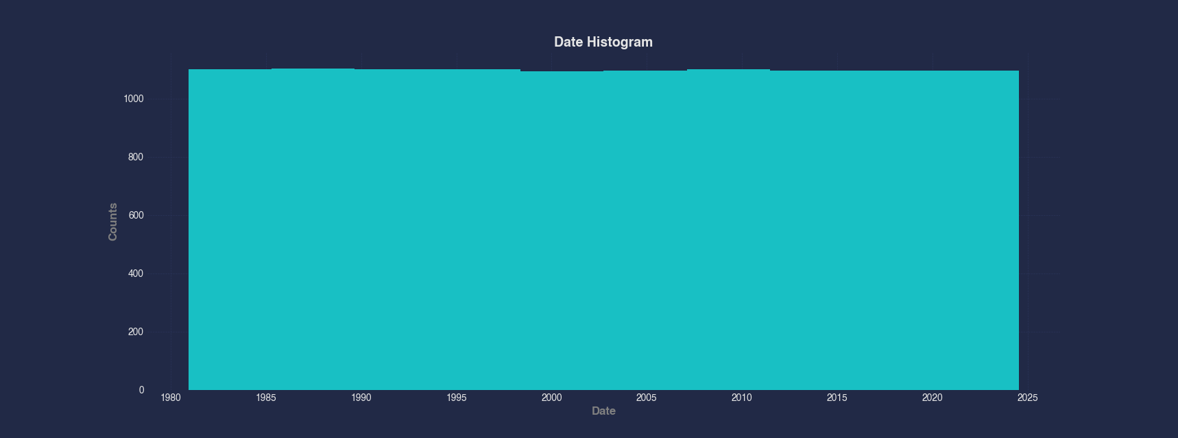
Example 4 - Plot Histogram with Custom Bin Count
You can specify the number of bins in a histogram to increase granularity. Here, we use 50 bins to better understand the distribution of trading Volume in the Apple stock data, revealing more detail than the default setting.
#> Histogram --x Volume --bins 50
AFLEFT  plt.hist(appleStockDf['Volume'], bins=50)

plt.title('Volume Histogram', fontsize=14, fontweight='bold')
plt.xlabel('Volume', fontsize=12, fontweight='bold', color='gray')
plt.ylabel('Counts', fontsize=12, fontweight='bold', color='gray')
plt.legend()
plt.grid(True, linestyle='--', linewidth=0.5)
plt.tick_params(axis='both', which='major', labelsize=10)  AFRIGHT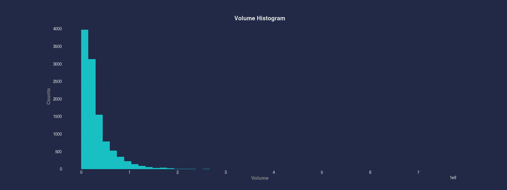
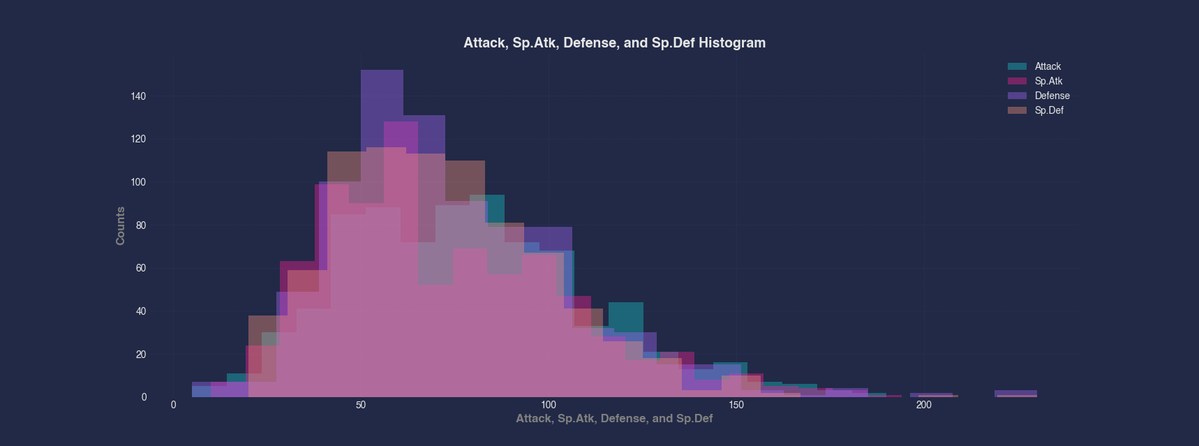
Example 5 - Compare Distributions of Multiple Columns
When comparing the distributions of several related columns, you can overlay multiple histograms on the same plot. In this case, we compare Attack, Sp.Atk, Defense, and Sp.Def from the Pokemon dataset, using the same bin count to observe their relative distributions.
#> Histogram --x Attack Sp.Atk Defense Sp.Def --bins 20
AFLEFT  plt.hist(pokemonDf['Attack'], bins=20, label='Attack', alpha=0.4)

plt.hist(pokemonDf['Sp.Atk'], bins=20, label='Sp.Atk', alpha=0.4)

plt.hist(pokemonDf['Defense'], bins=20, label='Defense', alpha=0.4)

plt.hist(pokemonDf['Sp.Def'], bins=20, label='Sp.Def', alpha=0.4)

plt.title('Attack, Sp.Atk, Defense, and Sp.Def Histogram', fontsize=14, fontweight='bold')
plt.xlabel('Attack, Sp.Atk, Defense, and Sp.Def', fontsize=12, fontweight='bold', color='gray')
plt.ylabel('Counts', fontsize=12, fontweight='bold', color='gray')
plt.legend()
plt.grid(True, linestyle='--', linewidth=0.5)
plt.tick_params(axis='both', which='major', labelsize=10)  AFRIGHT