Bubble
Creates a bubble plot, similar to a scatter plot, except that each point has a size
Options
x: Specifies the data column to use on the x-axis
y: Specifies the data column to use on the y-axis
z: Specifies the data column to use on the z-axis
size: Specifies the data column to use for the size of the bubble
group: Column specifying how to color the data in the plot
where: Condition on which to filter the data
3d: Flag that projects 2 dimensional groups onto a 3 dimensional plot
samePlot: A flag that forces multiple plots to be rendered on the same plot
sameWindow : A flag that forces multiple plots to be rendered on the same window
year: Specifies the year component of the dataset or time-related analysis. This flag allows you to filter or focus on data within a specific year for more granular insights
month : Denotes the month component of the dataset or time-related analysis. This flag helps you zoom into data for a particular month within a given year, offering a focused view of seasonal or monthly trends
day: Refers to the day component of the dataset or time-related analysis. This flag filters the data to represent specific days, providing a fine-grained level of detail for daily trends or activities.
Examples
Example 1 - Bubble Plot of Numerical vs Categorical
This example creates a bubble chart to compare player ages (a numerical column) across different NBA teams (a categorical column). The x-axis is the team and each bubble’s size reflects the number of blocks recorded by the player, giving additional insight into defensive contributions by age and team.
#> Bubble --x Team --y Age --size BLK
AFLEFT  plt.scatter(nBADf['Team'].astype('category').cat.codes, nBADf['Age'], color=colorCycle[colorCycleIndex], label='Age', s=nBADf['BLK'])

plt.gca().set_xticklabels(nBADf['Team'].astype('category').cat.categories, rotation=45)
plt.gca().set_xticks(range(len(nBADf['Team'].astype('category').cat.categories)))

plt.title('Age vs Team', fontsize=14, fontweight='bold')
plt.xlabel('Team', fontsize=12, fontweight='bold', color='gray')
plt.ylabel('Age', fontsize=12, fontweight='bold', color='gray')
plt.legend()
plt.grid(True, linestyle='--', linewidth=0.5)
plt.tick_params(axis='both', which='major', labelsize=10)  AFRIGHT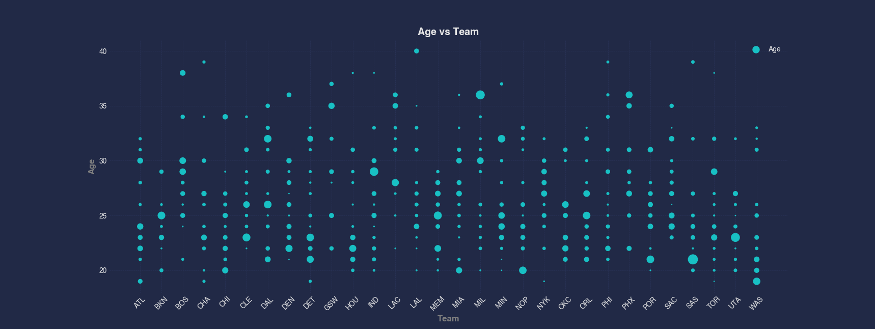
Example 2 - Bubble Plot by Index
When visualizing data without a natural x-axis, plotting against index can still provide insight. In this example, we use the index as the x-axis and plot Points as the y-axis, using bubble size to represent the number of Wins per player.
#> Bubble Points --size Wins
AFLEFT  indexForPlot = range(len(nBADf['Points']))

plt.scatter(indexForPlot, nBADf['Points'], marker='o', color=colorCycle[colorCycleIndex], label='Points', s=nBADf['Wins'])

plt.title('Points vs Index', fontsize=14, fontweight='bold')
plt.xlabel('Index', fontsize=12, fontweight='bold', color='gray')
plt.ylabel('Points', fontsize=12, fontweight='bold', color='gray')
plt.legend()
plt.grid(True, linestyle='--', linewidth=0.5)
plt.tick_params(axis='both', which='major', labelsize=10)  AFRIGHT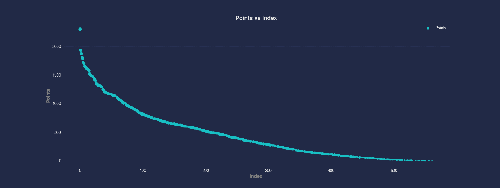
Example 3 - Multi-Series Bubble Plots
This chart overlays three separate bubble plots to show how blocks, assists, and field goal percentage vary with wins. Each metric is plotted against wins, and the bubble size corresponds to the number of losses, allowing for comparative visual analysis of multiple performance indicators.
#> Bubble --x Wins --y BLK AST FG_Percent --size Losses
AFLEFT  plt.scatter(nBADf['Wins'], nBADf['BLK'], color=colorCycle[colorCycleIndex], label='BLK', s=nBADf['Losses'])

colorCycleIndex = (colorCycleIndex + 1) % len(colorCycle)

plt.scatter(nBADf['Wins'], nBADf['AST'], color=colorCycle[colorCycleIndex], label='AST', s=nBADf['Losses'])

colorCycleIndex = (colorCycleIndex + 1) % len(colorCycle)

plt.scatter(nBADf['Wins'], nBADf['FG_Percent'], color=colorCycle[colorCycleIndex], label='FG_Percent', s=nBADf['Losses'])

plt.title('BLK, AST, and FG_Percent vs Wins', fontsize=14, fontweight='bold')
plt.xlabel('Wins', fontsize=12, fontweight='bold', color='gray')
plt.ylabel('BLK, AST, and FG_Percent', fontsize=12, fontweight='bold', color='gray')
plt.legend()
plt.grid(True, linestyle='--', linewidth=0.5)
plt.tick_params(axis='both', which='major', labelsize=10)  AFRIGHT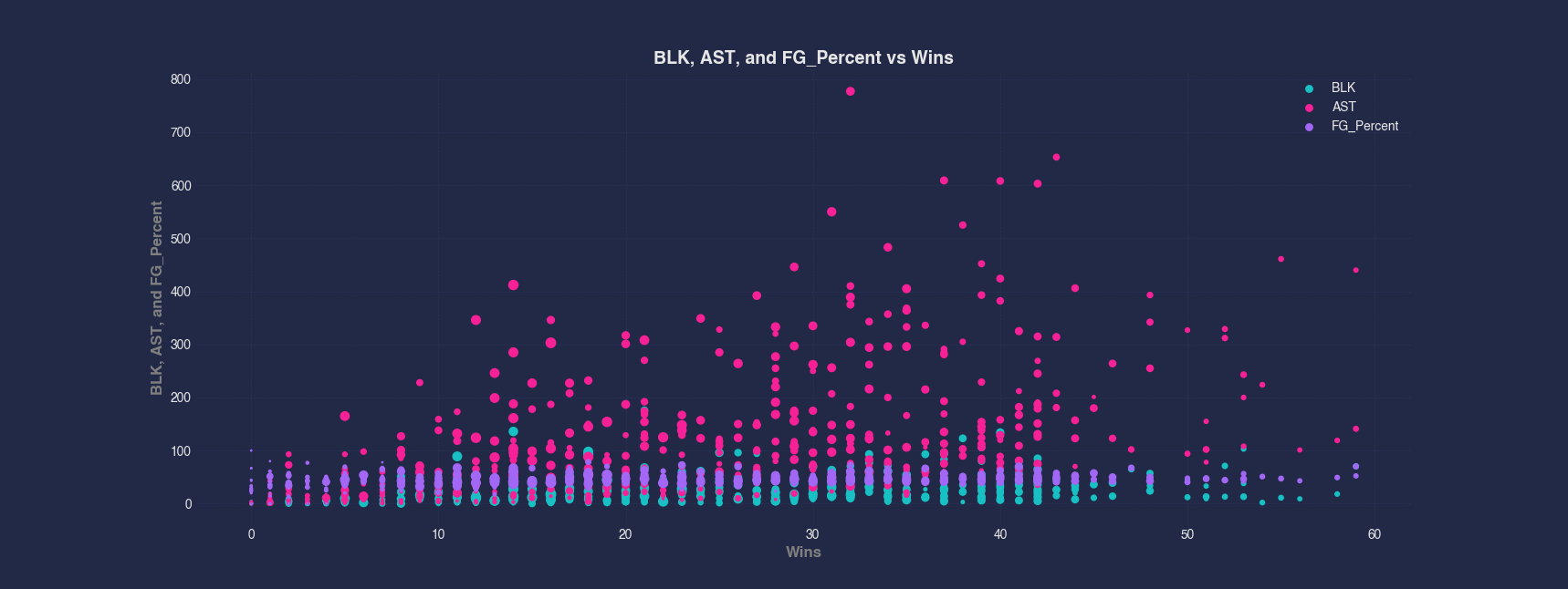
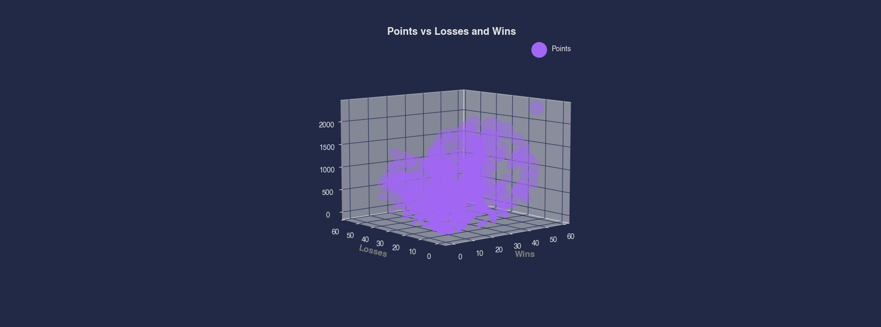
Example 4 - 3D Bubble Plot
In this 3D visualization, Points are plotted against both Wins and Losses to provide a multi-dimensional view of performance. The size of each bubble reflects the player’s total rebounds, adding another layer of statistical context to the visualization.
#> Bubble --x Wins --y Losses --z Points --size REB
AFLEFT  plt.axes(projection='3d')

plt.gca().scatter(nBADf['Wins'], nBADf['Losses'], nBADf['Points'], color=colorCycle[colorCycleIndex], label='Points', s=nBADf['REB'])

plt.title('Points vs Losses and Wins', fontsize=14, fontweight='bold')
plt.xlabel('Wins', fontsize=12, fontweight='bold', color='gray')
plt.ylabel('Losses', fontsize=12, fontweight='bold', color='gray')
plt.legend()
plt.grid(True, linestyle='--', linewidth=0.5)
plt.tick_params(axis='both', which='major', labelsize=10)  AFRIGHT