BoxPlot
Creates a box and whisker plot to show the distribution of data for 1 or more columns, shows the quantiles and outliers for different columns
Options
x: Specifies the data columns, series, or lists to use on the x-axis
where: Condition on which to filter the data
separate: Graphs each box plot on its own xy axis
samePlot: A flag that forces multiple plots to be rendered on the same plot
sameWindow : A flag that forces multiple plots to be rendered on the same window
year: Specifies the year component of the dataset or time-related analysis. This flag allows you to filter or focus on data within a specific year for more granular insights
month : Denotes the month component of the dataset or time-related analysis. This flag helps you zoom into data for a particular month within a given year, offering a focused view of seasonal or monthly trends
day: Refers to the day component of the dataset or time-related analysis. This flag filters the data to represent specific days, providing a fine-grained level of detail for daily trends or activities.
Examples
Example 1 - Create Boxplots of All Numeric Columns
Use a boxplot to quickly understand the distribution of each numeric column in the dataframe. This example automatically creates a single boxplot for each numeric column, all plotted together on one figure for easy comparison.
#> BoxPlot
AFLEFT  xTickIndex = 0
for i, boxplotColumn in enumerate(pokemonDf.columns):
    if is_numeric_dtype(pokemonDf[boxplotColumn]) and not is_bool_dtype(pokemonDf[boxplotColumn]):
        plt.boxplot(pokemonDf[boxplotColumn], patch_artist=True, positions=[xTickIndex], labels=[boxplotColumn])
        xTickIndex += 1

plt.title('pokemonDf', fontsize=14, fontweight='bold')
plt.legend()
plt.grid(True, linestyle='--', linewidth=0.5)
plt.tick_params(axis='both', which='major', labelsize=10)  AFRIGHT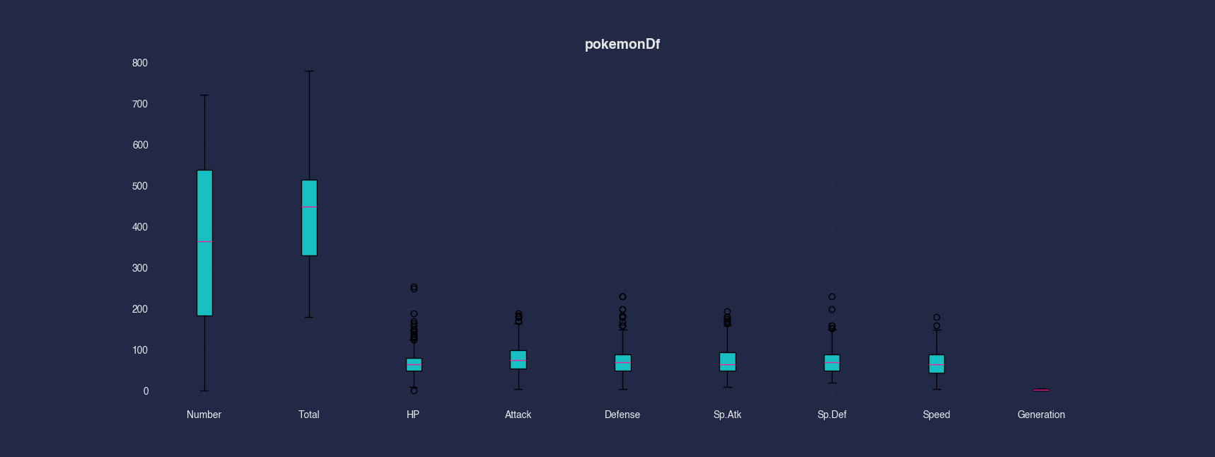
Example 2 - Create Separate Boxplot Axis for Each Numeric Column
Instead of plotting all numeric columns in a single axis, this example generates a dedicated subplot for each numeric column. This layout allows you to see each distribution more clearly and avoids plots having vastly different ranges when there are many numeric fields.
#> BoxPlot --separate
AFLEFT  nonNumericColumnCount = 0
for i, boxplotColumn in enumerate(pokemonDf.columns):
    if is_numeric_dtype(pokemonDf[boxplotColumn]) and not is_bool_dtype(pokemonDf[boxplotColumn]):
        nonNumericColumnCount += 1

_, boxplotAxes = plt.subplots(nrows=1, ncols=nonNumericColumnCount, figsize=(10, 5))
xTickIndex = 0
for i, boxplotColumn in enumerate(pokemonDf.columns):
    if is_numeric_dtype(pokemonDf[boxplotColumn]) and not is_bool_dtype(pokemonDf[boxplotColumn]):
        boxplotAxes[xTickIndex].boxplot(pokemonDf[boxplotColumn], patch_artist=True, positions=[0], labels=[boxplotColumn])
        xTickIndex += 1

plt.suptitle('pokemonDf', fontsize=14, fontweight='bold')
plt.legend()
plt.grid(True, linestyle='--', linewidth=0.5)
plt.tick_params(axis='both', which='major', labelsize=10)  AFRIGHT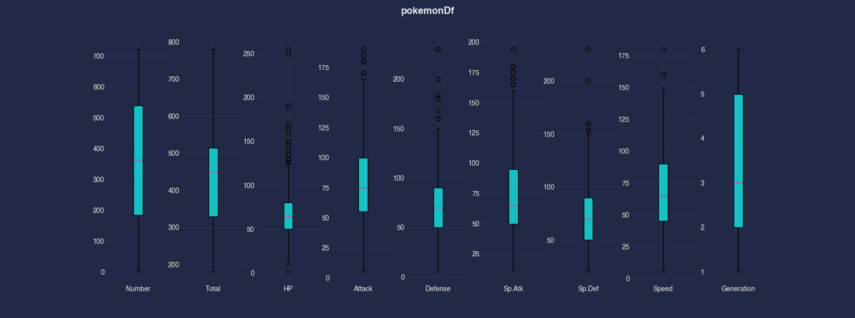
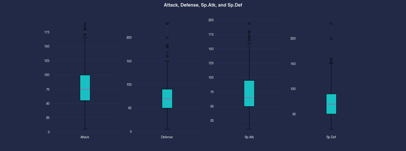
Example 3 - Create Boxplots for Selected Columns
Rather than plotting all numeric columns, this example focuses only on a specified subset: Attack, Defense, Sp.Atk, and Sp.Def. These boxplots help us compare the variability and central tendencies of key Pokemon battle attributes.
#> BoxPlot --x Attack Defense Sp.Atk Sp.Def
AFLEFT  plt.boxplot(pokemonDf['Attack'], patch_artist=True, positions=[0], labels=['Attack'])

plt.boxplot(pokemonDf['Defense'], patch_artist=True, positions=[1], labels=['Defense'])

plt.boxplot(pokemonDf['Sp.Atk'], patch_artist=True, positions=[2], labels=['Sp.Atk'])

plt.boxplot(pokemonDf['Sp.Def'], patch_artist=True, positions=[3], labels=['Sp.Def'])

plt.title('Attack, Defense, Sp.Atk, and Sp.Def', fontsize=14, fontweight='bold')
plt.legend()
plt.grid(True, linestyle='--', linewidth=0.5)
plt.tick_params(axis='both', which='major', labelsize=10)  AFRIGHT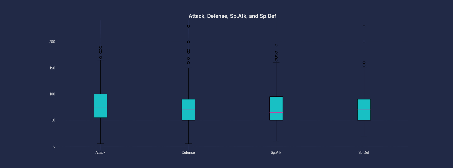
Example 4 - Create Separate Boxplot Axis for Selected Columns
This example combines selective plotting with individual subplots, allowing us to view the distribution of specific columns (Attack, Defense, Sp.Atk, and Sp.Def) each in its own axis. This makes detailed comparison easier, especially when columns vary in scale or spread.
#> BoxPlot --x Attack Defense Sp.Atk Sp.Def --separate
AFLEFT  _, boxplotAxes = plt.subplots(nrows=1, ncols=4, figsize=(10, 5))
boxplotAxes[0].boxplot(pokemonDf['Attack'], patch_artist=True, positions=[0])
boxplotAxes[0].set_xticks([0], ['Attack'])

boxplotAxes[1].boxplot(pokemonDf['Defense'], patch_artist=True, positions=[0])
boxplotAxes[1].set_xticks([0], ['Defense'])

boxplotAxes[2].boxplot(pokemonDf['Sp.Atk'], patch_artist=True, positions=[0])
boxplotAxes[2].set_xticks([0], ['Sp.Atk'])

boxplotAxes[3].boxplot(pokemonDf['Sp.Def'], patch_artist=True, positions=[0])
boxplotAxes[3].set_xticks([0], ['Sp.Def'])

plt.suptitle('Attack, Defense, Sp.Atk, and Sp.Def', fontsize=14, fontweight='bold')
plt.legend()
plt.grid(True, linestyle='--', linewidth=0.5)
plt.tick_params(axis='both', which='major', labelsize=10)  AFRIGHT