Bar
Creates a bar graph 2 or 3 dimensions. Can also use --group or --where conditions.
Options
x: Specifies the data column to use on the x-axis
y: Specifies the data column to use on the y-axis
z: Specifies the data column to use on the z-axis
group: Column specifying how to color the data in the plot
where: Condition on which to filter the data
3d: Flag that projects 2 dimensional groups onto a 3 dimensional plot
samePlot: A flag that forces multiple plots to be rendered on the same plot
sameWindow : A flag that forces multiple plots to be rendered on the same window
year: Specifies the year component of the dataset or time-related analysis. This flag allows you to filter or focus on data within a specific year for more granular insights
month : Denotes the month component of the dataset or time-related analysis. This flag helps you zoom into data for a particular month within a given year, offering a focused view of seasonal or monthly trends
day: Refers to the day component of the dataset or time-related analysis. This flag filters the data to represent specific days, providing a fine-grained level of detail for daily trends or activities.
Examples
Example 1 - Bar Graph of Counts of Categorical Column
When working with a categorical column, such as Team, it is often useful to understand the distribution of values. This example shows a bar chart of the count of records of each team, helping identify which teams are represented more frequently in the data.
#> Bar --x Team --xCategorical --count
AFLEFT  values = nBADf['Team'].astype('str').value_counts().sort_index().values
indices = nBADf['Team'].astype('str').value_counts().sort_index().index

plt.bar(indices, values, color=colorCycle[colorCycleIndex], label='Team' + ' - count')

plt.title("'Team' count", fontsize=14, fontweight='bold')
plt.ylabel('count', fontsize=12, fontweight='bold', color='gray')
plt.legend()
plt.grid(True, linestyle='--', linewidth=0.5)
plt.tick_params(axis='both', which='major', labelsize=10)  AFRIGHT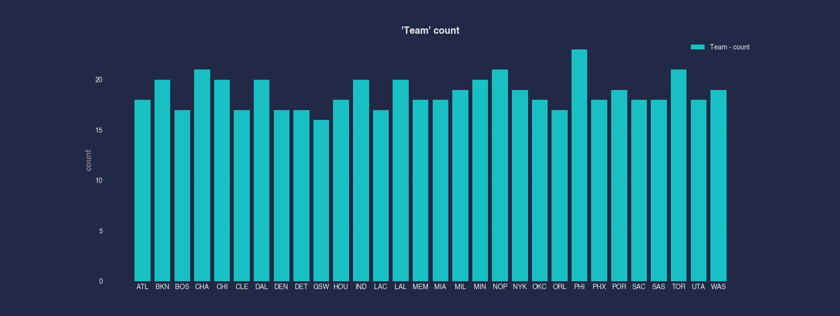
Example 2 - Bar Graph of Sum by Category in Column
Rather than showing counts, we can sum a numerical column, like Points, across each category in a column. Here, we sum all points scored by players on each team and show that total as a bar chart.
#> Bar --x Team --xCategorical --y Points --sum
AFLEFT  nBADfGroup = nBADf.groupby(['Team'])['Points']
nBADfGroupSum = nBADfGroup.sum()
nBADfGroupSum = pd.DataFrame(nBADfGroupSum).reset_index(names=['Team'])

plt.bar(nBADfGroupSum['Team'].astype('category').cat.codes, nBADfGroupSum['Points'], label='Points' + ' - sum')

plt.gca().set_xticklabels(nBADfGroupSum['Team'].astype('category').cat.categories, rotation=45)
plt.gca().set_xticks(range(len(nBADfGroupSum['Team'].astype('category').cat.categories)))

plt.title('Points vs Team', fontsize=14, fontweight='bold')
plt.xlabel('Team', fontsize=12, fontweight='bold', color='gray')
plt.ylabel('Points', fontsize=12, fontweight='bold', color='gray')
plt.legend()
plt.grid(True, linestyle='--', linewidth=0.5)
plt.tick_params(axis='both', which='major', labelsize=10)  AFRIGHT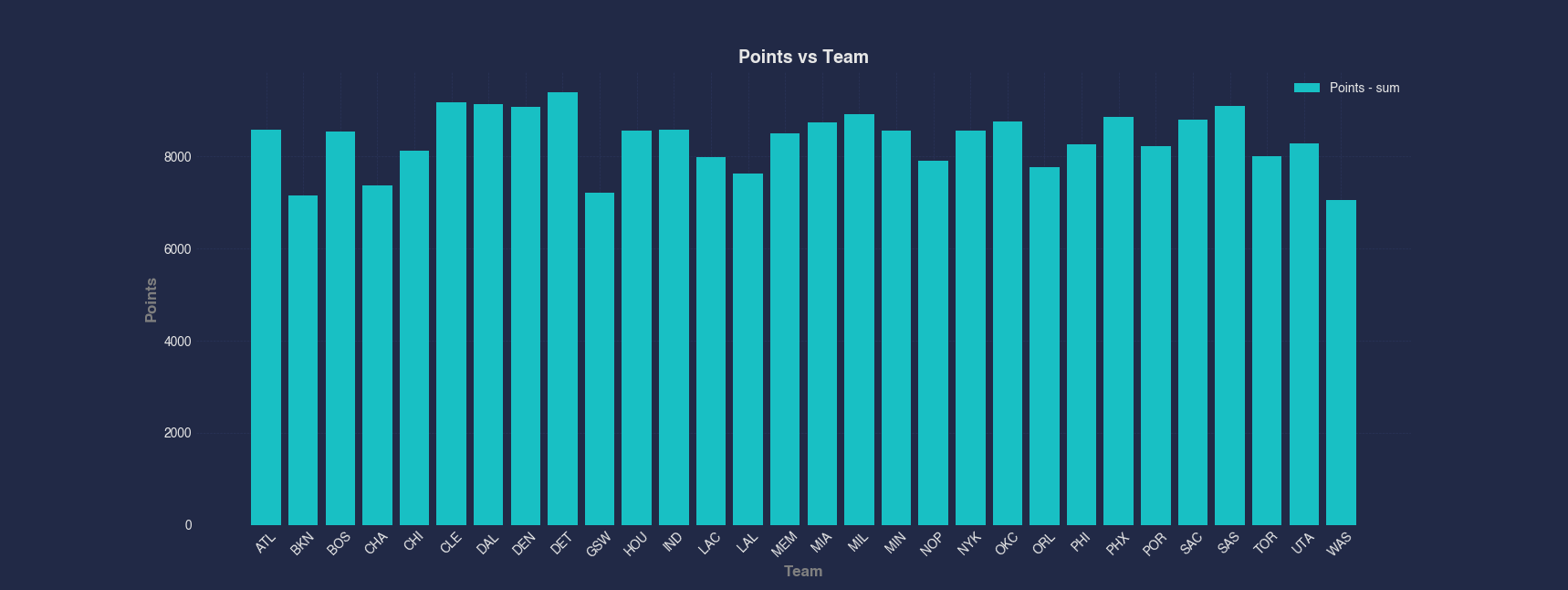
Example 3 - Bar Graph from a Numeric Column by Index
Sometimes you may want to create a simple bar chart directly from a single numeric column. In this case, we chart Age by row index to get a sense of how age varies across players and is graphed in order by index.
#> Bar Age
AFLEFT  indexForPlot = range(len(nBADf['Age']))

plt.bar(indexForPlot, nBADf['Age'], color=colorCycle[colorCycleIndex], label='Age')

plt.title('Age vs Index', fontsize=14, fontweight='bold')
plt.xlabel('Index', fontsize=12, fontweight='bold', color='gray')
plt.ylabel('Age', fontsize=12, fontweight='bold', color='gray')
plt.legend()
plt.grid(True, linestyle='--', linewidth=0.5)
plt.tick_params(axis='both', which='major', labelsize=10)  AFRIGHT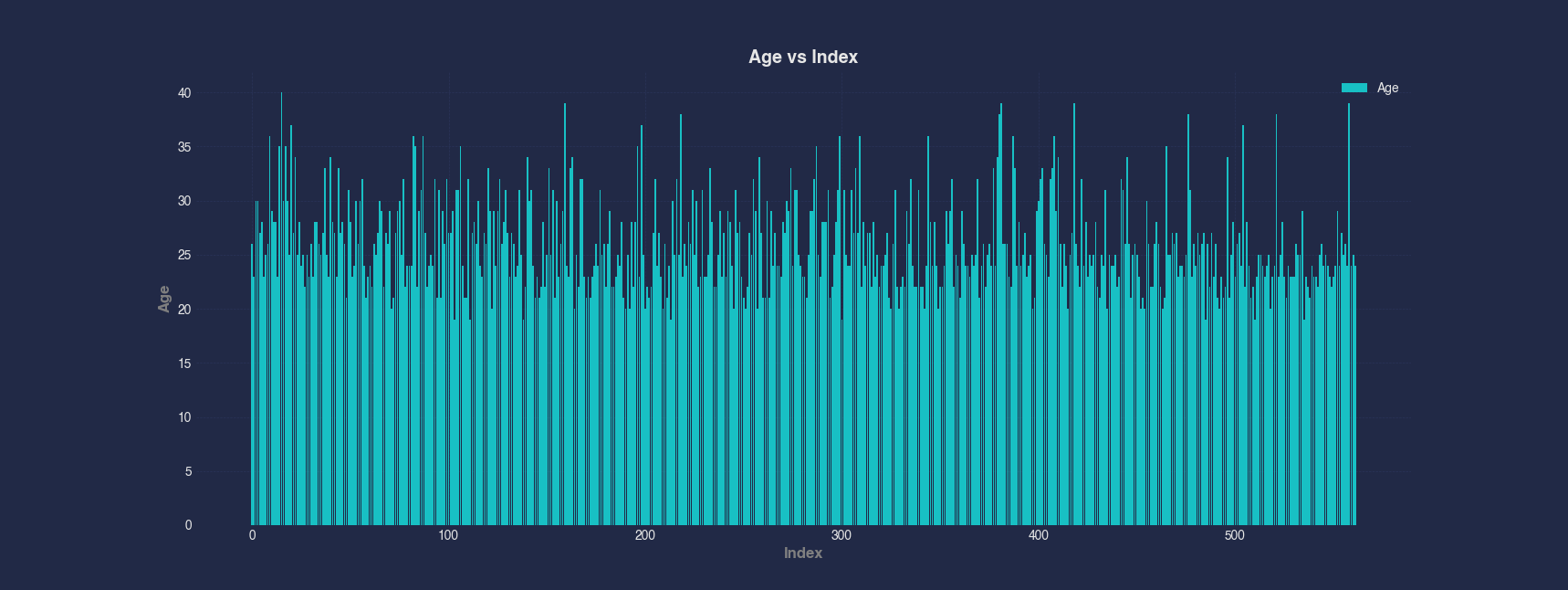
Example 4 - Bar Graph of Numerical Column vs Numerical Column
You can use a bar chart to display bars that are located on the x-axis according to one column with a height according to another column. Additionally, you can use an aggregation method for bars with the same x-axis value. This example shows the average number of Wins for each value of Losses to help visualize performance patterns.
#> Bar --x Losses --y Wins --mean
AFLEFT  nBADfGroup_1 = nBADf.groupby(['Losses'])['Wins']
nBADfGroup_1Mean = nBADfGroup_1.mean()
nBADfGroup_1Mean = pd.DataFrame(nBADfGroup_1Mean).reset_index(names=['Losses'])

barWidth = 0.8
plt.bar(nBADfGroup_1Mean['Losses'], nBADfGroup_1Mean['Wins'], barWidth, label='Wins' + ' - mean')

plt.title('Wins vs Losses', fontsize=14, fontweight='bold')
plt.xlabel('Losses', fontsize=12, fontweight='bold', color='gray')
plt.ylabel('Wins', fontsize=12, fontweight='bold', color='gray')
plt.legend()
plt.grid(True, linestyle='--', linewidth=0.5)
plt.tick_params(axis='both', which='major', labelsize=10)  AFRIGHT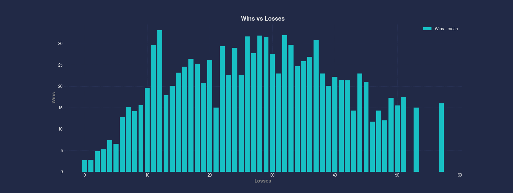
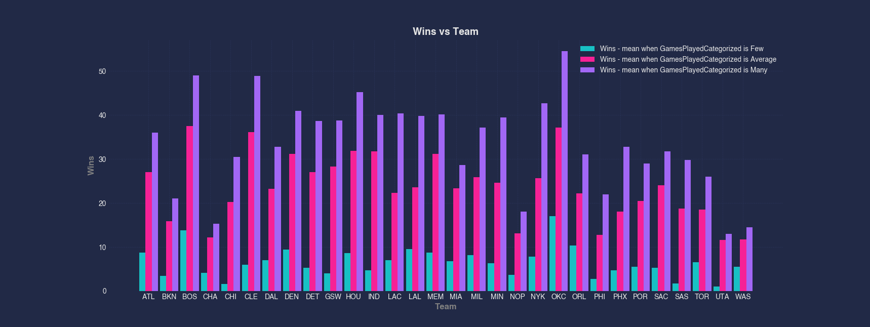
Example 5 - Grouped Bar Chart by Subcategory
For deeper comparisons, you can group a bar chart by subcategories. This example shows the mean Wins for each team, broken down further by a categorized version of GamesPlayed (Few, Average, Many). This type of chart is useful for comparing performance across both team and games played per player.
#> Bar --x Team --y Wins --group GamesPlayedCategorized --mean
AFLEFT  nBADf['TeamCategories'] = nBADf['Team'].astype('category').cat.codes
nBADf['GamesPlayedCategorizedCategories'] = nBADf['GamesPlayedCategorized'].astype('category').cat.codes
nBADfGroup_2 = nBADf.groupby(['TeamCategories', 'GamesPlayedCategorizedCategories'])['Wins']
groupedRowsMean = nBADfGroup_2.mean()
groupedRowsMean = pd.DataFrame(groupedRowsMean).reset_index(names=['Team', 'GamesPlayedCategorized'])

for gamesPlayedCategorizedIndex, gamesPlayedCategorizedValue in enumerate(groupedRowsMean['GamesPlayedCategorized'].unique()):
    groupedRows = groupedRowsMean[groupedRowsMean['GamesPlayedCategorized'] == gamesPlayedCategorizedValue]

    num_bars = len(nBADf['GamesPlayedCategorized'].unique())
    barWidth =  .9 / num_bars
    plt.bar(groupedRows['Team'] + gamesPlayedCategorizedIndex * barWidth - (num_bars - 1) * barWidth / 2, groupedRows['Wins'], barWidth, label='Wins' + ' - mean' + f" when GamesPlayedCategorized is {nBADf['GamesPlayedCategorized'].astype('category').cat.categories[gamesPlayedCategorizedIndex]}")

    colorCycleIndex = (colorCycleIndex + 1) % len(colorCycle)
plt.gca().set_xticklabels(nBADf['Team'].astype('category').cat.categories)
plt.gca().set_xticks(range(len(nBADf['Team'].astype('category').cat.categories)))
nBADf = nBADf.drop(['TeamCategories', 'GamesPlayedCategorizedCategories'], axis=1)

plt.title('Wins vs Team', fontsize=14, fontweight='bold')
plt.xlabel('Team', fontsize=12, fontweight='bold', color='gray')
plt.ylabel('Wins', fontsize=12, fontweight='bold', color='gray')
plt.legend()
plt.grid(True, linestyle='--', linewidth=0.5)
plt.tick_params(axis='both', which='major', labelsize=10)  AFRIGHT